Friday, February 28, 2025

Art: Albert Einstein Memorial: The Big Brain Statue That Listens to Your Secrets

There he is. Slouched on a cold granite bench like a man who just realized relativity doesn’t work on Mondays. The Albert Einstein Memorial, sculpted by Robert Berks, is Washington, D.C.’s most brooding genius, a 12-foot-tall bronze behemoth with equations in one hand and a “seen some things” expression on his face. The man figured out the fundamental nature of the universe, and they immortalized him looking like he’s debating whether to finish his pastrami sandwich or take a nap.

This monument was unveiled in 1979, marking 100 years since Einstein was born and 24 years since he peaced out of this mortal coil—presumably because he was tired of explaining E = mc² to people who still believed in astrology. Berks, who had a thing for famous faces (he also sculpted JFK’s memorial at the Kennedy Center), based this work on a bust he did of Einstein in 1953, when the physicist was still alive and probably tolerating it out of politeness. The statue itself weighs four tons, which is about how much information Einstein carried in his head at any given time.

And then there’s the star map—2,700 metal studs embedded in the 28-foot-wide granite dais, mapping out celestial objects exactly as they appeared on the dedication day. It’s like a cosmic Easter egg hunt for astronomy nerds, except the prize is realizing how small and irrelevant we all are in the grand scheme of things. Stand in the center of the dais, and your voice amplifies—which means if you ever wanted to scream your deepest, darkest regrets to the universe while Einstein stares at you in judgment, this is the place to do it.

The statue is also a favorite among tourists, mostly because it’s one of the few D.C. monuments you can actually climb without getting tackled by security. Some people sit in Einstein’s lap. Others whisper sweet nothings into his bronze ears. A few brave souls attempt to interpret his facial expression—existential despair? Cosmic enlightenment? The moment you remember you left the oven on? Who’s to say?

The Meaning? Oh, It’s Heavy.

Beyond the quirky quirks, this is a monument to the power of thought, to a guy who revolutionized science with nothing but his mind while humanity was still figuring out how to properly cook a hot dog. The three equations carved into the manuscript in his hand aren’t just fancy squiggles—they’re the foundation of modern physics:

 General Relativity (space and time are in an eternal wrestling match).

 The Photoelectric Effect (without this, no solar panels—enjoy your high energy bills).

 E = mc² (the equation that launched a thousand nuclear nightmares).

And because Einstein wasn’t just about math but also about not being terrible to each other, the back of the bench is engraved with three of his greatest hits on truth, justice, and the importance of not being a jerk:

1. Civil liberty is cool.

2. The universe is mind-blowing.

3. You have a duty to seek the truth (so maybe stop getting your news from memes).

But the Real Question Is…

If Einstein could stand up, stretch out those stiff bronze legs, and take a look around today—would he be impressed, horrified, or just really into TikTok?

#Relativity #BigBrainEnergy #EinsteinVibes #BronzeAndBrooding #PhysicsNerdsUnite

Film - Wolf Creek (2005) – A Bloody Detour into the Australian Outback


If you ever wanted to take a scenic road trip through the breathtaking vastness of the Australian outback, Wolf Creek is here to slap the GPS out of your hands, flatten your tires, and introduce you to the most terrifying Crocodile Dundee reject ever put to film. Greg McLean’s horror debut is a grim, brutal, and occasionally brilliant exercise in outback survival—if by “survival,” you mean waiting around to see who gets their spinal cord severed first. It’s a nasty little film, drenched in the sweat and terror of its naive backpackers, but despite its grotesque flourishes, it somehow falls just short of being a horror classic. Think The Texas Chain Saw Massacre, but with more kangaroos and fewer chainsaws.

The Outback’s Answer to Freddy Krueger

McLean started working on the script in the late 1990s, when he was still figuring out how to make a slasher film that didn’t feel like it belonged in the discount bin of a Blockbuster in its final days. Initially, Wolf Creek was a straightforward stalk-and-slash affair, but McLean, inspired by the real-life horrors of Ivan Milat (Australia’s most notorious serial killer) and Bradley Murdoch (who murdered British tourist Peter Falconio), decided to inject a little more realism—and a lot more sheer human suffering—into the story.

Of course, the marketing team took this inspiration and ran with it, plastering “Based on True Events” all over the film like a gory badge of honor. Never mind that it’s about as historically accurate as Braveheart. Yes, people have disappeared in the outback. Yes, Milat and Murdoch were walking advertisements for not hitchhiking in Australia. But no, there’s no confirmed outback-dwelling lunatic named Mick Taylor keeping a scrapbook of screaming backpackers. (Or at least, that’s what we hope.)

Casting, Production, and the Outback That Hates You

Casting John Jarratt as Mick Taylor was a stroke of twisted genius. Up until Wolf Creek, Jarratt was best known for gardening shows and lighthearted Aussie television. So, naturally, he was the perfect choice to become Australia’s answer to Leatherface. He didn’t just play Mick Taylor—he became Mick Taylor. He lived in the outback for weeks, didn’t shower, and even perfected the most unsettling serial-killer laugh this side of a Joker audition. Cassandra Magrath, Kestie Morassi, and Nathan Phillips, playing the doomed backpackers, did their best to make us care about their fate, though let’s be real—no one walks into a movie like this expecting a happy ending.

Shot on a modest budget of $1.4 million, the film had all the indie scrappiness of a student film but with way more blood and terror. The shoot was grueling—actors got covered in dirt, endured freezing temperatures, and had to run barefoot through thorn-filled terrain. The setting, an abandoned mine, wasn’t just a chilling backdrop; it was also the actual site of a real-life murder. (Because apparently, Wolf Creek wasn’t terrifying enough.) Even the second unit crew had their own Blair Witch-style horror experience when a random trucker—who looked suspiciously like Mick Taylor—rolled up on them in the middle of the night.

Reception, Legacy, and Roger Ebert’s Personal Nightmare

When Wolf Creek premiered at Sundance, it divided audiences faster than an unmarked dirt road in the outback. Some praised its slow-burn dread and gritty realism, calling it a masterpiece of Australian horror. Others, like Roger Ebert, absolutely hated it. And by hated, I mean he gave it zero stars and suggested that if you enjoyed it, you might want to reconsider your entire moral compass.

Critics were torn—some saw it as a brilliantly unsettling take on the “killer-in-the-outback” trope, while others (mostly in the U.S.) found it cruel and excessive. The film made bank, though, pulling in over $30 million worldwide, making it one of Australia’s most successful horror films. It also kickstarted a wave of Aussie horror movies that leaned heavily into “outback terror,” as if the country’s terrifying wildlife wasn’t already doing that job just fine.

A sequel followed in 2013, dialing Mick’s sadism up to eleven, and a TV series ran from 2016-2017. As for Wolf Creek 3, it’s been “in development” for years, which either means McLean is taking his time crafting something truly horrifying, or Mick Taylor has finally run out of backpackers to torture.

Horror Classic or Relentless Misery?

So where does Wolf Creek land in the horror hall of fame? It’s brutal, it’s unrelenting, and it’s undeniably effective. But it also leaves you feeling like you need to take a shower, call your mom, and never, ever accept a ride from anyone in the outback. Three stars—not quite a masterpiece, but still enough to make you swear off road trips for good.

Is Wolf Creek a brilliant piece of horror filmmaking—or just sadistic, nihilistic torture porn? You decide.

⭐️⭐️⭐️ (3/5)

#MickTaylorIsWatching #TrustNoOne #AustraliaHatesYou #NotAllBackpackersMakeItHome #RIPRogerEbertsFaithInCinema


Monday, February 24, 2025

Art: Abraham Lincoln and the Nerds Who Built America


If you think a bunch of science guys and Honest Abe sitting around a table sounds like a recipe for a riveting piece of art, you’d be mostly wrong—but here we are. Hanging solemnly in the National Academy of Sciences (NAS) is The Founders’ Portrait, a painting by Albert Herter, a guy whose resume includes murals, portraits, and the noble duty of making dead historical figures look way more interesting than they actually were. It’s a grand, stately piece depicting Lincoln signing the NAS charter while being glared at by the finest scientific minds of 1863, presumably debating whether they should start working on germ theory or just go home and die of dysentery.

Albert Herter, A Man Who Painted Like It Paid the Bills

Albert Herter (1871–1950) was basically the artistic equivalent of a history teacher with a dramatic streak. He was an old-school painter, known for lush, romanticized scenes of Important People Doing Important Things. The kind of guy who looked at a blank canvas and thought, This needs some powdered wigs, a few waistcoats, and the weight of historical destiny.

But Herter wasn’t just a guy who painted politicians looking pensive—he had serious chops. His works graced grand civic spaces, including state capitals, railway stations, and even the walls of the Waldorf Astoria (back when staying there didn’t mean remortgaging your house). His style? Rich, theatrical, and deeply devoted to making historical moments look like Shakespearean tragedies—because what’s the point of painting history if everyone doesn’t look one emotional breakdown away from changing the course of civilization?

Lincoln, Science, and a War-Torn America

Now, why was Lincoln even signing off on a National Academy of Sciences in the middle of the Civil War? Because, believe it or not, science mattered—even back when leeches were still considered cutting-edge medical tech. In 1863, Lincoln greenlit the NAS, giving America’s brightest minds a clubhouse where they could tinker, theorize, and make sure the Union Army had better cannons than the Confederacy.

The timing? Not an accident. The war wasn’t just a battlefield clash; it was an arms race. The Union needed innovation, and Lincoln—being the 19th-century’s undisputed MVP of multitasking—figured, “Hey, let’s throw some scientific brainpower at this thing.” And thus, the NAS was born, a government-sanctioned think tank before “think tanks” became synonymous with overpaid consultants and vague policy papers.

More Than Just Old Guys in Fancy Coats

Herter’s painting captures this moment with all the reverence you’d expect. Lincoln sits at a desk, surrounded by bearded intellectuals who look like they’d rather be testing steam engines than posing for a portrait. The NAS founders—guys like Joseph Henry and Alexander Dallas Bache—peer on with expressions ranging from “Yes, this is a monumental day for science” to “Can we wrap this up? I left my Bunsen burner on.”

And Lincoln? The man of the hour? He looks characteristically thoughtful, probably wondering if this signing is as historically significant as abolishing slavery or if it’ll just be another piece of paper that future historians debate about on C-SPAN. But here’s the thing—this moment was significant. It was the official marriage of American politics and science, an acknowledgment that progress and policy need to share a bed (preferably one with clean data sheets).

Still Hanging, Still Watching

Today, the painting looms over the NAS like a reminder that, once upon a time, America valued scientists enough to put them in fancy artwork instead of conspiracy theory YouTube videos. It’s a time capsule of an era when presidents actually consulted experts, and scientific progress was a patriotic duty rather than an internet debate.

Take a moment to appreciate the irony: Lincoln gave science a seat at the table, and a century and a half later, half the country still doesn’t believe in climate change.

If Lincoln saw what we did with the whole “science” thing, do you think he’d sign that charter again—or just go back to reading Shakespeare?

#HistoryInPaint #AbeAndTheBrainTrust #ScientificRevolution #ArtistsWhoPaidRent #GermTheoryMatters #WhereIsMyFlyingCar #HonestAbeWouldBeExhausted

Film: God Told Me To… But Should You?

Larry Cohen’s God Told Me To (1976) is the kind of movie that slinks into your subconscious like an uninvited dinner guest who refuses to leave until you’ve questioned every major life decision. It’s a theological fever dream wrapped in a sci-fi conspiracy and stuffed inside a cop drama—like The Exorcist met Chinatown and got abducted by aliens along the way. With a blend of police procedural grit, religious paranoia, and Cohen’s usual brand of gonzo filmmaking, it’s a film that aims high, lands somewhere between brilliance and chaos, and leaves you staring at your screen thinking, “Did I just watch a gritty crime thriller or an extended Twilight Zone episode with a drinking problem?”

The Bible, Aliens, and a Guy Who Just Didn’t Care

Larry Cohen, never one to turn down a high-concept, low-budget thrill ride, took inspiration for this cinematic acid trip from two sources: the Bible and Chariots of the Gods. Yes, Cohen took one look at the Good Book and said, “You know what would make this better? Murderous messiahs and virgin births via UFO.” The result? A movie where divine intervention isn’t just a plot device—it’s an extraterrestrial recruitment strategy.

The film was backed by Edgar Scherick and Daniel Blatt, who, upon seeing the final cut, promptly demanded their names be taken off it—perhaps a sign that Cohen’s vision was just a little too out there, even for 1970s Hollywood. It was shot guerrilla-style in New York City, meaning permits were as nonexistent as the boundaries of Cohen’s imagination. This was a man who, instead of dealing with red tape, simply rolled cameras and hoped nobody noticed—like an indie filmmaker with a vendetta against legal processes.

Casting, Production, and a Parade of Chaos

Originally, the lead role of NYPD detective Peter Nicholas went to Robert Forster, but a few days in, he and Cohen had a creative “disagreement” (read: Forster got tired of Cohen’s on-set shouting and walked). Enter Tony Lo Bianco, who took over and delivered a performance that teeters between hardboiled detective and a guy who just found out his Uber driver is actually a reptilian overlord.

Then there’s Richard Lynch as Bernard Phillips, an androgynous, telepathic, possibly divine entity who wants to birth a new species with his half-brother. It’s a role that somehow manages to be both unsettling and oddly convincing—like if David Bowie had decided to start a cult instead of a music career.

Oh, and Andy Kaufman makes his big-screen debut as a police officer who opens fire on the St. Patrick’s Day parade. Cohen, in his infinite wisdom, had no permit for this scene, meaning Kaufman, in full uniform, nearly got mobbed by actual parade-goers. It’s a moment of pure Cohen—equal parts reckless and brilliant, where real-world chaos and fictional lunacy collide.

Cult Classic or Just a Cult?

Upon release, God Told Me To was met with the kind of reception usually reserved for suspicious meat in a cafeteria. Roger Ebert, never one to mince words, awarded it a single lonely star, likely while clutching his pearls and muttering about cinema’s decline. But like all misunderstood weirdos in film history, this one aged into cult status, eventually landing on Rolling Stone’s list of “20 Scariest Films You’ve Never Seen.”

Critics at the time dismissed it as too bizarre, too unfocused, and too unhinged—essentially Cohen’s entire brand. But in an era where horror now consists mostly of “elevated” indie fare or recycled jump scares, God Told Me To stands out for having the audacity to be batshit crazy on purpose.

Divine Madness, But Make It Cinema

At its core, God Told Me To is a film that asks, “What if God was a creepy alien being with a secret agenda?”—which is probably not the sermon your local priest would appreciate. It’s not perfect. It’s not even coherent at times. But it’s ambitious, it’s unsettling, and it’s a prime example of Cohen’s knack for turning B-movie schlock into something strangely profound.

So, should you watch it? That depends. Do you like your horror with a side of existential dread and UFO conspiracies? Do you think The X-Files would have been better if David Duchovny occasionally screamed at the sky? If so, step right up—because Larry Cohen has a sermon for you.

So, if an omnipotent being whispered in your ear and told you to watch this, would you listen?

⭐️⭐️⭐️ (3/5)

#CultCinema #GodToldMeTo #WhatDidGodTellYou #PermitsAreForCowards #AlienMessiahs #ReligiousHorror #RogerEbertWasNotAMused


Sunday, February 23, 2025

Art: Monkey Business: Jill Greenberg’s Monkeysuit


There are portraits that capture beauty. There are portraits that capture power. And then there’s Monkeysuit, a portrait that captures the raw, existential despair of someone who has seen too much, said too little, and just realized he left the oven on at home.

Jill Greenberg has made a career out of making animals look more human than humans. Monkeysuit is no exception. The subject—a mandrill, a primate already halfway between beast and businessman—stares directly into your soul with an expression that is equal parts world-weary philosopher and underpaid office worker who just sat through a two-hour Zoom call that could have been an email.

Jill Greenberg: The Queen of “Too Real”

Greenberg is known for her high-gloss, hyper-real style, where lighting and post-production turn subjects into something more than real—like looking at the world through a lens that has been sharpened to the point of absurdity. She has applied this technique to Hollywood stars, political figures, crying children, and now, a mandrill who looks like he’s about to tell you that life is pain.

This isn’t just a pretty picture of a monkey. This is a calculated, carefully crafted commentary on how we project human emotions onto animals—or perhaps, how those animals are just reflecting back what they see in us.

When a Monkey in a Suit is Just a Suit in a Monkey

Monkeysuit is part of Greenberg’s Monkey Portraits series, created during the mid-2000s, a time when America was deep in the throes of pop-culture saturation and digital manipulation. The idea of authenticity was already dissolving. Was The Real World real? Did anything in magazines look the way it did in real life? Monkeysuit fits right into that chaotic landscape, blurring the line between reality and artifice, humanity and primate, comedy and tragedy.

Historically, humans have loved dressing animals up—whether for science, entertainment, or because someone thought it was funny to make a dog wear a hat. Greenberg, however, doesn’t rely on gimmicks. She doesn’t need to put a monkey in a suit to make it look like one of us. She just captures its face.

More Than Just a Pretty Face (With Better Lighting Than You’ll Ever Have)

At first glance, Monkeysuit is funny. It’s a monkey that looks a little too human—maybe like your uncle at Thanksgiving who just lost a bet, maybe like your boss when they realize the company is about to tank. But the longer you look, the more unsettling it becomes.

The mandrill’s expression is hauntingly complex. It suggests sadness, intelligence, exhaustion, and—dare we say—disappointment. But is the disappointment directed at us? Are we looking at an animal that is merely playing the part of a human, or are we seeing something deeper—a reflection of our own hollow-eyed, too-tired, over-it-all reality?

Greenberg doesn’t spell it out, and that’s why Monkeysuit works. It sits in that uncomfortable space between humor and tragedy, between fine art and satire.

Final Verdict: The Most Relatable Monkey Ever

Monkeysuit is brilliant, hilarious, and existentially disturbing. It’s Jill Greenberg at her best—using light, shadow, and her unsettlingly sharp aesthetic to hold up a mirror we weren’t ready for. The joke is that we see ourselves in this mandrill. The bigger joke is that we can’t look away.

If a mandrill can convey human emotion better than most actors, what does that say about Hollywood? 🤔

#MonkeyBusiness #JillGreenberg #ExistentialApe #ArtOrRoast #TooReal

Film: Artists and Models: A Fever Dream in VistaVision

They don’t make ‘em like this anymore—probably because Hollywood can no longer afford to bankroll a movie that looks like a nuclear explosion of Technicolor, slapstick, and mid-century paranoia. Artists and Models (1955) is Dean Martin and Jerry Lewis at their most unhinged, a film that tries to be a musical, a satire, a romance, a buddy comedy, and a spy thriller—all at once. The result is dazzling, exhausting, and oddly prophetic. It’s a movie that mocks comic book hysteria, only to become one. And in case you’re wondering, yes, it’s still better than Morbius.

A Little History, A Lot of Madness

By 1955, Martin and Lewis were kings of Hollywood—America’s favorite odd couple. Martin played the smooth-talking crooner with a drink in his hand, and Lewis was the human sound effect machine, an adult toddler in suspenders. But Artists and Models was different. This wasn’t just another wacky comedy; it was their first film with director Frank Tashlin, a former Looney Tunes animator who saw Lewis and thought, “This man should be a cartoon.”

And so, Tashlin leaned in. Hard. Every scene pops like a Tex Avery short: people stretch, explode, shriek, and zip across the frame at physics-defying speeds. It’s also packed with the director’s not-so-subtle vendetta against comic books, which he loathed with the passion of a 1950s PTA mom. The film is stuffed with jabs at the industry, inspired by the real-life Senate hearings on whether comics were turning America’s youth into violent lunatics. (Spoiler: they weren’t. They were turning them into Stan Lee.)

Ironically, Artists and Models loves comics too much to really kill them. The best parts of the film—Jerry Lewis’s delirious dreams of Vincent the Vulture, the absurdity of secret rocket formulas hidden in bedtime stories, the entire Bat Lady subplot—are a celebration of everything wild, weird, and wonderful about pulp fiction. Tashlin set out to make a takedown. He accidentally made a love letter.

The Stars, The Sidekicks, and the Scene-Stealers

Let’s be clear: Shirley MacLaine steals this movie.

Her character, Bessie Sparrowbush (who named these people?!), is a whirlwind of energy, throwing herself at Jerry Lewis with the force of a thousand exclamation points. This was only MacLaine’s second film, and she got the role because Lewis saw her understudy in The Pajama Game and thought, “That one.” He was right. She’s a walking, talking firecracker.

Dean Martin is, well, Dean Martin. He spends half the movie looking amused, the other half crooning his way into women’s hearts. His character, Rick Todd, is a struggling artist who finds success by stealing ideas from Jerry Lewis’s nightmares—because ethics were looser back then. Meanwhile, Lewis’s Eugene Fullstack (again, these names) is a man-child obsessed with comic books, whose dreams contain classified government secrets. Nobody questions this because, again, the ‘50s.

The supporting cast is stacked with scene-stealers: Dorothy Malone as the frustrated comic book artist-turned-activist, Jack Elam as a cartoonishly evil spy, and Anita Ekberg in a blink-and-you’ll-miss-it role that exists mostly to make men say, “Wow.” The film also features a spaceship model repurposed from Conquest of Space (1955), because nothing in Hollywood ever goes to waste, not even props.

Over Budget, Over the Top, and Just Right

Artists and Models was one of the most expensive Martin and Lewis movies, costing $1.7 million—$103,083 over budget, thanks to Jerry Lewis’s “meddling” (according to producer Hal B. Wallis, who must have had a migraine by the end of this shoot). It was shot in VistaVision, Technicolor, and Perspecta Stereo Sound, which means it looks and sounds better than half the movies made today.

Tashlin’s signature blend of slapstick and innuendo is all over this thing. The censors cut some of his more outrageous gags, but the film still gets away with plenty of eyebrow-raising moments. There’s a scene where Dorothy Malone is almost wearing a towel. There’s a joke about a character’s last name being “Fullstick” that had to be changed because—well, you get it. The film was marketed as family-friendly, but in reality, it’s a winking, self-aware send-up of 1950s pop culture, packed with jokes that flew over kids’ heads but landed directly in their parents’ cocktails.

The Cult Classic That Keeps On Giving

When Artists and Models hit theaters, critics weren’t sure what to make of it. Was it a comedy? A sci-fi movie? A political satire? A fever dream? The answer was “yes.” It was a box office hit, but like all Martin and Lewis films, it was dismissed as fluff—until later generations realized, hey, this thing is actually brilliant.

It found new life as a cult classic, helped along by its inclusion in 1001 Movies You Must See Before You Die (because apparently, you can’t die without seeing Jerry Lewis scream about birds in space). It’s also loaded with Hollywood inside jokes, including a sly reference to Rear Window (1954) when Secret Service agents complain about their bad vantage point.

Over the years, it’s gained a reputation as one of the best Martin and Lewis films, and one of the sharpest comedies of the 1950s. It’s been released on DVD, Blu-ray, and is probably lurking on some streaming service right now, waiting to baffle a new generation.

Final Verdict: Four Stars for Madness

Artists and Models isn’t a perfect film. It’s too chaotic, too long, and too in love with its own zaniness. But that’s exactly why it works. It’s a time capsule of mid-century Hollywood at its most extravagant, a satire that can’t help but adore the thing it’s satirizing, and a showcase for a young Shirley MacLaine proving she’s going to be a star. It’s funny, weird, messy, and kind of brilliant.

If comic books were really corrupting youth, what movie today would be the Artists and Models of our time—satirizing pop culture while secretly loving it?

⭐️⭐️⭐️⭐️ (4/5)

#DeanAndJerry #OldHollywood #TooMuchEnergy #ArtistsAndMadness #BatLadyForever


Saturday, February 22, 2025

Art: William Couper’s Darwin Bust: A Beard, A Brain, and A Bronze Legacy


Some statues exude power. Some demand reverence. And then there’s William Couper’s Charles Darwin bust, which mostly stares into the abyss as if it’s deeply regretting publishing On the Origin of Species before securing the copyright. Perched in the National Science Foundation, this glorious hunk of bronze captures Darwin in full philosophical grandpa mode, pondering the mysteries of evolution—or maybe just wondering why people keep arguing about it 150 years later.

William Couper: The Sculptor of Serious Beards

William Couper was the kind of sculptor who made statues that felt important. Born in 1853, he was a Virginia-born, European-trained artist who had a flair for classical realism. Unlike the modern artists who might just throw a rock on a pedestal and call it “Existential Despair,” Couper actually cared about craft. He made things look like things, and his bust of Darwin? It’s the Michelangelo’s David of men who spent too much time indoors reading about barnacles.

Commissioned in 1909 for the 100th anniversary of Darwin’s birth, Couper’s bust was originally housed at the American Museum of Natural History before it found its way back to the New York Academy of Sciences. Because, clearly, nothing says science like playing musical chairs with a very serious-looking bronze head. Today, copies exist in a few elite science institutions, because if you’re going to worship at the altar of rational thought, you must have a bust of Darwin judging you from across the room.

A Bust That Means Business

The bust itself is an ode to the thinking man. Darwin is not smiling. Darwin is not casual. No, Darwin is staring into eternity with the expression of someone who just realized he left his notebook on the Beagle. Couper, ever the perfectionist, captured the full gravitas of a man who revolutionized biology and got a lifetime of angry letters from people who preferred their history without apes in the family tree.

The sculpting work is stunning—every crease in Darwin’s face, every wave in his untamed beard, meticulously immortalized in metal. This isn’t just a bust—it’s a statement. A reminder that science is about questioning, theorizing, and occasionally growing an epic beard while dismantling centuries of theological certainty.

The Legacy: Still Evolving

Over a century later, Couper’s Darwin bust remains a fixture in scientific institutions, where it continues to silently judge students, professors, and random passersby who have the audacity to not be pondering the mysteries of natural selection at all times. It’s been cast, recast, and shipped off to places like the National Science Foundation, where it can quietly remind bureaucrats that adaptation is key.

Of course, Darwin himself probably never expected to be immortalized in such grand fashion—he was a humble guy. But if he were alive today, he’d probably chuckle at the sheer weight of his own head, now replicated across multiple continents. And he’d definitely have something to say about the fact that people are still debating whether evolution is a thing.

The Big Question

If Charles Darwin could evolve into a giant metal statue, what great scientific mind should be next in line for an immortal bronze makeover? Should we be prepping a Carl Sagan bust, complete with cosmic wonder? Or a Marie Curie statue, glowing (literally) with radioactive energy?

Drop your votes below. Because natural selection might be inevitable—but choosing the next great scientific statue is still up for debate.

#DarwinInBronze #EvolutionInArt #BeardGoals #WilliamCouper #ScienceNeverSleeps #BronzeAgeThinkers

Film: A Three-Star Review of The Terminal Man (1974): A Sci-Fi Misfire with a Killer Premise

You ever see a movie that makes you wonder if the director was trying to lull you into a coma? Well, folks, welcome to The Terminal Man (1974), a film that takes a dynamite premise—science, paranoia, and a brain-hacked George Segal—and somehow makes it feel like a slow afternoon at the DMV. Directed by Mike Hodges, this was supposed to be a chilling cautionary tale about technology gone rogue. Instead, it’s a masterclass in how to make a thriller without thrills, a horror movie that mostly horrifies your patience. But hey, it’s not all bad—if you squint, you can see the makings of something brilliant buried under the sterile hospital lighting and glacial pacing.

A Story Too Smart for Its Own Good

The film is based on Michael Crichton’s The Terminal Man, a novel written by a man who somehow predicted Jurassic Park, AI takeovers, and corporate espionage before the rest of us even figured out how to program a VCR. Naturally, Warner Bros. thought they had a surefire hit—what could go wrong with a story about a guy whose brain is wired to a machine that controls his seizures, only to have it turn him into a blackout-prone murder machine? Turns out, quite a bit.

Crichton was originally hired to write the script, which makes sense since, you know, he wrote the book. But Hollywood, in all its wisdom, decided that his own adaptation didn’t stick to the source material enough. Imagine writing a novel, being asked to adapt it, then being told, Nah, this isn’t quite right, pal. So, Crichton got the boot, and another writer took over. The final product is technically faithful to the novel but lacks the kind of propulsive energy that made Crichton’s work so gripping. It’s like reading a medical textbook written in Latin—informative, maybe, but good luck staying awake.

Casting, Production, and the Art of Making a Thrill-Free Thriller

Then we come to the casting. George Segal plays Harry Benson, our unfortunate techno-guinea pig. Now, Segal was a fine actor, known more for light comedy than dark sci-fi, which made this an inspired, if not entirely successful, choice. He spends most of the film alternating between blank stares and sudden bouts of violence, which, ironically, is also how audiences probably felt watching it. Joan Hackett plays his psychiatrist, Dr. Janet Ross, and she does her best to inject some humanity into this clinical fever dream. The supporting cast, including Richard Dysart and Donald Moffat, are all pros, but the material doesn’t give them much to chew on.

Visually, the film should be interesting. Director Mike Hodges (Get Carter) aimed for a stark, sterile look, inspired by the paintings of Edward Hopper. And you do see that influence—lonely corridors, empty city streets, a creeping sense of isolation. The problem is that while Hopper’s paintings evoke a feeling, The Terminal Man mostly evokes the feeling of waiting at a bus stop in the rain. Even when Benson goes on his inevitable rampage, it feels strangely muted, like watching a security camera feed of a crime that happened yesterday.

Critical Reception: Too Smart, Too Slow, Too… Something?

So, how did audiences and critics take to this high-minded exercise in controlled sedation? Not well. The film was dumped in the U.S. after a disastrous preview screening where the first ten minutes were projected without sound—which, honestly, might have made the movie more exciting. Critics, for the most part, eviscerated it. Nora Sayre of The New York Times called it slow and lifeless, which is a polite way of saying, “Why did I sit through this?” Audiences also weren’t sold—partly because Segal was still known for comedy, partly because the marketing was a mess, and partly because it’s just not a crowd-pleaser.

But here’s the twist: The Terminal Man found some high-profile fans. Stanley Kubrick, the grandmaster of slow, cerebral cinema, reportedly loved it. Terrence Malick even wrote a gushing letter to Hodges about how profound it was. This is the kind of film that film school professors pretend to like while their students struggle to stay awake through it.

Legacy: A Cult Classic That’s Still Kind of a Drag

Over time, the film has earned a little more respect. Some critics have revisited it and found merit in its icy aesthetics and ahead-of-its-time themes about technology and the human mind. In a way, it was prophetic—electrode implants, neural interfaces, AI-controlled medicine, all of it has become very real. If this movie were remade today (hopefully with a better editor), it might actually work.

But as it stands? The Terminal Man is a frustrating watch. It has moments of brilliance buried under layers of sterile, methodical pacing. It’s a film that wants to be 2001: A Space Odyssey but plays more like a hospital instructional video. Three stars for ambition, cinematography, and the guts to make a bleak sci-fi thriller this unrelentingly bleak. But if you’re looking for fun, tension, or even a pulse… well, you might want to reboot elsewhere.

What do you think—underrated sci-fi gem or a cinematic sedative? Would you give The Terminal Man another shot, or is one viewing terminal enough?

⭐️⭐️⭐️ (3/5)

#MindControl #SciFiMissedOpportunity #KubrickLikedIt #CrichtonGotFired #SlowBurnOrJustSlow

Friday, February 21, 2025

Art: The Van Syckel Children: A Portrait of Elegance, Guns, and Questionable Smiles

The 1840s were a time of expansion, refinement, and deeply committed family portraits, where sitting still for hours was the price of social immortality. The Van Syckel Children is a prime example of this era’s peculiar blend of ambition and formality, where every silk fold, every stray curl, and every misplaced firearm was painstakingly recorded for future generations to admire—or question.

Painted by the enigmatic L. S. Biberoy (or Bibory, depending on how legible you find 19th-century signatures), this portrait is an arresting display of wealth, taste, and that classic Yes, we are important people energy. While little is known about Biberoy today, their work on this piece suggests a keen eye for fabric textures, a meticulous approach to facial expressions (read: slightly eerie), and a commitment to making sure everyone looked equally glossy and severe.

A Closer Look: The Power Dynamics of a Portrait

At first glance, The Van Syckel Children appears to be a traditional family portrait, but a deeper reading reveals a carefully curated tableau of authority, domesticity, and subtle social messaging.

The mother, seated at the left, is the picture of cultivated grace. Her silver gown, with its voluminous sleeves and rich, rippling folds, is a clear statement of wealth—this is not an outfit one wears for comfort but for status. The careful placement of her hand on a small book suggests education, refinement, and a quiet intellectual presence. The book itself, positioned at an angle that doesn’t necessarily imply recent reading, functions less as a tool of learning and more as an emblem of cultural sophistication. Beside her, an elegant umbrella rests against the seat, another silent symbol of gentility and preparedness.

Behind her, the father stands with a commanding presence, gripping a double-barreled shotgun with the kind of practiced ease that suggests he’s either fresh from a successful hunt or simply unwilling to pose without an overt display of masculinity. His posture, leaning forward slightly with one arm resting possessively over his wife’s chair, reinforces his role as both protector and head of the household. His dark suit and neatly combed hair contrast sharply with the softness of the women’s attire, emphasizing the traditional gendered expectations of the time.

To the right, the two daughters present a study in delicate innocence and emerging poise. The older girl, dressed in a deep blue gown, leans forward slightly with a serene yet knowing expression, her hand resting lightly on her younger sister’s shoulder. The younger child, dressed in pale pink, holds a small blue bird—a classic symbol of innocence, fleeting youth, and, in some interpretations, the fragility of life itself. Her expression is sweet yet slightly mischievous, as if she’s aware that her grasp on the bird (both literal and symbolic) is tenuous at best.

At their feet, a small spaniel with an almost comically dramatic expression looks up at the child and her avian companion, either out of affection or hunger—it’s unclear which. A small woven basket, tipped onto its side, spills out flowers and fruit, another subtle nod to abundance, domestic bliss, and perhaps the unpredictability of youth.

The Art of Social Image-Making

In an era where photography was still in its infancy, commissioned portraits like this were the ultimate social calling card. They were not mere depictions of family life but declarations of status, lineage, and personal identity. To have one’s family immortalized in oil paint—especially at such a grand scale—was a privilege reserved for those with means.

Everything about The Van Syckel Children suggests intentionality. The clothing, with its meticulous rendering of fabric sheen and lace detailing, was a direct reflection of affluence. The setting, an impossibly lush and peaceful outdoor scene, reinforced the family’s connection to nature and tranquility, despite the realities of mid-19th-century urban life. The presence of the hunting rifle and dog introduced themes of self-sufficiency and control, while the carefully balanced interplay between the figures—especially the daughters’ gestures of affection—hinted at the virtues of familial harmony.

Power Wrapped in Poise

Beyond its surface beauty, the portrait subtly reinforces the rigid social structure of the time. The father, standing behind his seated wife, asserts both dominance and protection. The mother, though central, remains composed, her role as the family’s cultured matriarch defined more by presence than action. The daughters, poised and decorative, embody the virtues expected of young women—grace, innocence, and refinement.

But despite all this formality, there is an underlying warmth. The soft smiles, the child’s gentle grasp on the bird, the casual lean of the father’s arm over his wife’s chair—these are small details that suggest genuine connection beneath the carefully curated social image.

The Takeaway: What Would Your 1840s Flex Be?

If this family had Instagram, this painting would be their pinned post—their most polished, most meticulously arranged version of themselves, put on display for the world to admire. And isn’t that, in the end, what portraiture was all about?

So the real question is: If you had to sit for a portrait today, what ridiculously unnecessary flex would you insist on including?

#FamilyButMakeItVictorian #HuntingRifleOrFashionStatement #ThatBirdIsNotMakingItToTheEndOfThisPainting #SilkDressesAndStiffSmiles #EvenTheDogLooksExhausted

FIlm: Lost Vikings, Blimps, and Disney’s Forgotten Epic: A Review of The Island at the Top of the World


 If you’ve ever wondered what happens when Disney decides to make 20,000 Leagues Under the Sea but with less Verne, more Vikings, and a gigantic floating balloon straight out of a Jules Verne fever dream, then The Island at the Top of the World (1974) is for you. A relic of the era when Hollywood still thought dirigibles were a viable mode of transport (spoiler: they weren’t), this forgotten fantasy adventure is both delightfully earnest and hilariously overblown. It’s a movie where old British aristocrats wander into the Arctic, discover an entire hidden Norse civilization, and react with the same mild surprise as someone finding an extra fry at the bottom of the bag. It may not be peak Disney, but it’s certainly an underrated gem, bursting with icy spectacle, questionable casting, and a plot that moves like a Viking longship rowing through Jell-O.

When Disney Went North Instead of Deep

By the early 1970s, Disney was looking to recapture the magic of its previous live-action adventure hits. The studio had seen success with 20,000 Leagues Under the Sea (1954) and In Search of the Castaways (1962), so naturally, someone in a boardroom thought, You know what we need? Another Victorian-era explorer movie, but this time with more blimps. Based on Ian Cameron’s novel The Lost Ones, the film took a few liberties—like swapping out a 1960s helicopter for a 1907 dirigible because, apparently, helicopters weren’t steampunk enough.

Development dragged on for years, with the first teaser appearing in 1968—six full years before the movie actually hit theaters. Disney had ambitious plans for the film, even considering a Disneyland attraction based on the Hyperionairship. That idea died faster than the Hyperion itself, which—spoiler alert—does not make it out of the movie in one piece. The film was ultimately helmed by Robert Stevenson, the go-to guy for Disney’s live-action flicks (Mary PoppinsBedknobs and Broomsticks), and while his touch is visible in the lavish sets and whimsical action, one gets the feeling that somewhere along the way, Disney realized that whales, Vikings, and airships might not be the box office slam dunk they’d hoped for.

A Ballooning Budget and a Viking-Sized Gamble

Originally, Disney had their eyes on Sean Connery for the lead role of Sir Anthony Ross, but Connery—being no fool—asked for a paycheck befitting a former Bond. Disney balked, and the role went to Donald Sinden, a perfectly respectable British actor whose name recognition in America hovered somewhere between “That Guy from That Thing” and “Sir Who?” Joining him was David Hartman as Professor Ivarsson, a performance so wooden it might have been mistaken for actual Norse architecture. Meanwhile, the film rounded out its cast with real Scandinavian actors speaking real Scandinavian languages that—despite what the script claims—were definitely not Old Norse.

Production was lavish, borrowing sets from Planet of the Apes (because nothing says “Viking adventure” like recycled sci-fi backdrops) and featuring impressive model work for the Hyperion airship. The plot is your classic “rich guy searches for missing son” affair, but with added dirigibles, killer whales, and a Viking dictator named The Godi who probably listened to too much death metal. The film’s climax features an obligatory explosion (because of course it does), and in the end, our heroes are forced to leave behind their good-natured, history-loving professor because, well, the Vikings demand a hostage. Makes perfect sense.

The Box Office Iceberg That Sank the Blimp

Despite its big-budget aspirations, The Island at the Top of the World failed to make a splash—financially speaking, it was less 20,000 Leagues Under the Sea and more The Black Hole. Critics were mixed, with some praising the visuals and adventure elements, while others questioned why Disney was still making Victorian-era explorer movies in the Star Wars decade. The film did snag an Oscar nomination for Best Art Direction but lost to The Godfather Part II—which is, let’s be honest, the cinematic equivalent of bringing a Viking sword to a mafia gunfight.

Disney had originally planned a sequel, more closely following Cameron’s novel, but when audiences collectively shrugged at the first film, those plans were quietly buried in an unmarked grave—probably next to Astragard. The Disneyland ride concept was also scrapped, though a reworked version of Hyperion ended up in Disneyland Paris’ Discoveryland, proving that no bad idea ever truly dies at Disney— it just gets repackaged.

Over time, the film has developed a small cult following, largely among fans of obscure Disney adventures, dirigible enthusiasts (yes, they exist), and people who enjoy watching 1970s special effects struggle to depict killer whale attacks. It remains a fascinating what-if, a glimpse at a Disney that could have gone full steampunk if only audiences had been a little more receptive to sky-high Victorian nonsense.

A Fun, Forgotten Relic Worth a Watch

Sure, The Island at the Top of the World didn’t set the box office ablaze, but that doesn’t mean it isn’t worth your time. It’s got spectacle, adventure, Vikings, and a giant blimp—what more do you need? It’s the kind of movie that reminds you of an era when Disney would take weird swings, sometimes connecting and sometimes missing so hard that the ball ends up in another time zone. If nothing else, it’s proof that, in the 1970s, Hollywood still believed that airships were cool—and honestly, they were right.

What’s your favorite forgotten Disney movie that deserves a second chance? Drop a comment below!

⭐️⭐️⭐️⭐️ (4/5)

#DisneyDeepCuts #HyperionDreams #VikingsOnIce #DirigiblesForever #SeanConneryDodgedABullet

Thursday, February 20, 2025

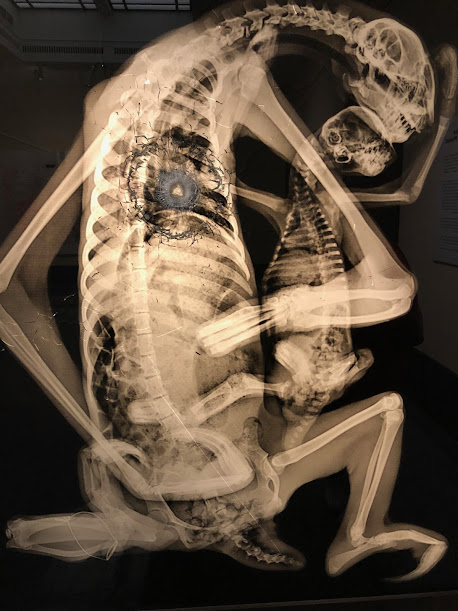
Art: Sloth Pieta: When Fine Art Smacks You in the Face with Your Own Hypocrisy


You ever see a piece of art that makes you question all your life choices? No? Well, let me introduce you to Sloth Pietaby Steve Miller. It’s a haunting, x-ray-laced gut punch disguised as fine art, a carbon-on-cotton wake-up call about our slow-motion destruction of the planet, and—if we’re being honest—a pretty solid indictment of the human race’s ability to ignore the obvious.

First, let’s get the title out of the way: Sloth Pieta. Sounds poetic, doesn’t it? Feels like it belongs in the halls of the Louvre, maybe next to some baroque masterpiece with dramatic lighting. But no, this one’s different. The “Pieta” part is a direct nod to Michelangelo’s sculpture of the Virgin Mary cradling the lifeless body of Jesus. Heavy stuff. But instead of religious salvation, Miller swaps in a mother sloth cradling her offspring, laid bare in an x-ray that strips away all pretense, leaving behind nothing but skeletal forms and an overwhelming sense of impending doom.

And let’s be real: when’s the last time you thought about a sloth for longer than a Reddit meme? Probably never. Miller takes that oversight and makes it your problem. By immortalizing this creature—one of the rainforest’s slowest, most defenseless inhabitants—in a piece that literally exposes its insides, he forces us to confront an uncomfortable truth: we are failing them. And by “them,” I mean not just sloths but all the fragile, irreplaceable pieces of the natural world that we’re steamrolling for convenience.

Now, about that technique. X-rays. Not oil paints, not marble, not some fancy experimental medium that critics pretend to understand—just cold, hard, scientific imaging. It’s an artistic mic drop. Miller doesn’t need metaphors. He doesn’t need exaggerated brushstrokes to make his point. He just peels back the skin and shows you the truth. And the truth is, nature is running out of time, no matter how slow a sloth moves.

The result? A piece that looks like it belongs in both an art gallery and a forensic investigation. And honestly, that’s kind of the point. When you look at Sloth Pieta, you’re not just seeing an image—you’re witnessing evidence. Evidence of habitat destruction, of species on the brink, of a planet being chipped away one deforested acre at a time. It’s the kind of thing that makes you reconsider whether that second plastic water bottle was really necessary.

And because irony is the universe’s favorite joke, Sloth Pieta was displayed at the Eli and Edythe Broad Art Museum, where well-dressed patrons can sip their ethically sourced lattes while standing in front of a portrait of environmental despair. Maybe some of them got the message. Maybe some just took an Instagram photo and moved on. But that’s the brilliance of Miller’s work—it sits with you. It lingers in the back of your mind like an uncomfortable truth you can’t shake.

At the heart of it, Sloth Pieta is a paradox. It’s about sloths, which are famous for being slow, but it’s also about urgency—because despite how leisurely they move, they’re running out of time. It’s about nature, but it’s also about human impact. It’s about life, but also death. And above all, it’s a reminder that sometimes, the most effective way to make people listen isn’t through grand speeches or dramatic documentaries—it’s by showing them something raw, something that strips away the distractions, something that makes them stop and think.

So yeah, maybe next time you see a sloth meme, remember Sloth Pieta and ask yourself: are we really as slow to react as they are? Because if we are, we might not get another chance.

#SlothPieta #SteveMillerArt #EnvironmentalArt #XRayArt #SaveTheSloths #ClimateCrisis #ArtForChange #HealthOfThePlanet #DeforestationAwareness #EcoArt


Film: Obsession (1976) – A Swirling, Sweaty, Psychosexual De Palma Special


Brian De Palma’s Obsession is what happens when you take Vertigo, run it through a fever dream, lace it with high melodrama, and let Bernard Herrmann sob his heart out onto the score. It’s overwrought. It’s excessive. It’s absolutely ridiculous. And it’s kind of great. Sure, Alfred Hitchcock probably hurled his brandy snifter at the wall when he saw what De Palma had cooked up here, but originality is overrated when you can just take Vertigo, crank the volume to eleven, and marinate it in enough Catholic guilt and Freudian chaos to make even a soap opera writer blush.

A History as Twisted as Its Protagonist’s Psyche

The origins of Obsession lie in a simple premise: “What if we remade Vertigo but somehow made it weirder?” De Palma, along with screenwriter Paul Schrader (who was still running high on his Taxi Driver cynicism), crafted a script called Déjà Vu—a title that screamed, “Yes, we know we’re ripping off Hitchcock, and we’re fine with it.” Schrader’s original script was an epic, a sprawling three-act opera of trauma and manipulation, culminating in a 1985-set coda that explored an even deeper level of disturbing love and fixation.

But De Palma, always the pragmatist (and by “pragmatist,” I mean someone with a healthy disdain for things that cost too much), hacked off the final act like a butcher prepping a slab of prime obsession-meat. Bernard Herrmann, the legendary composer behind Psycho, took one look at Schrader’s original ending and reportedly told De Palma to “get rid of it.” This, coming from a man who thought stabbing strings were a reasonable way to depict showering. Schrader was, understandably, livid and disavowed the movie faster than a film school student denying their love of Fight Club.

Cliff Robertson, Tantrums, and Tanning Lotion

If Obsession has a weak link, it’s Cliff Robertson, who reportedly made life on set a waking nightmare. Not only did he insist on a deep bronze tan that left cinematographer Vilmos Zsigmond shrieking in frustration—at one point, he allegedly shoved Robertson into a wooden wall and screamed, “You are the same color as this wall!”—but he also gave deliberately bad performances during Geneviève Bujold’s reverse shots. It’s one thing to chew the scenery; it’s another to sabotage your co-star because you don’t want her stealing focus.

Bujold, on the other hand, is the heart and soul of this twisted tale, delivering a performance so tragically romantic that Bernard Herrmann straight-up fell in love with her. She visited the London recording sessions, complimented him on how his music “made love to her” since Robertson wouldn’t, and Herrmann reportedly burst into tears. His widow later found a picture of Bujold in his wallet after his death. The man wasn’t composing a film score—he was composing a love letter.

Then there’s John Lithgow, playing Robertson’s oily business partner with the kind of Southern accent that suggests he was raised on mint juleps and villainy. De Palma has said that he regretted casting Robertson, but Lithgow? Lithgow is right at home, gleefully twisting the knife at every turn like a man who already knows he’s going to be playing evil psychiatrists and deranged killers for the next forty years.

A Film That Critics Couldn’t Quite Quit

Upon release, Obsession was met with a combination of intrigue, praise, and the occasional dramatic eye-roll. Roger Ebert was all in, celebrating it as an “overwrought melodrama” and arguing that its excess was precisely what made it work. Pauline Kael, normally De Palma’s loudest cheerleader, dismissed it as “whirling around nothingness,” which is a polite way of saying, “Brian, please get some therapy.” Vincent Canby was unimpressed, pointing out that it was essentially Vertigo with an extra layer of Freudian nightmare fuel, but let’s be honest—that’s a selling point.

Columbia Pictures, clearly unsure of what they had, dumped the film into theaters in late August, a graveyard slot where movies go to die. Instead, it thrived. Herrmann’s swelling, tragic score practically yanked audiences into their seats, and Obsession became De Palma’s first substantial box-office hit. Sure, the incestuous undertones were a bit much, and the wedding sequence had to be visually softened to avoid some very uncomfortable questions, but the movie found its fans. Over the decades, it’s gained cult appreciation, with modern critics recognizing it as a stylistic powerhouse. If Vertigo is a carefully constructed psychological study, Obsession is that study after it’s been drinking heavily and making regrettable life choices.

The Verdict: Four Stars of Hypnotic Madness

Obsession is the cinematic equivalent of staring into a funhouse mirror and realizing that, yes, the distortion is deeply unsettling—but you can’t look away. It’s a fever dream of loss, manipulation, and Geneviève Bujold existing so luminously that even Bernard Herrmann was ready to ditch reality for her. Cliff Robertson is miscast, but Bujold and Lithgow carry the film, and De Palma, for all his Hitchcockian lifting, delivers a hallucinatory nightmare that lingers long after the credits roll.

⭐️⭐️⭐️⭐️ (4/5)

#VertigoOnSteroids #GenevièveBujoldDeservedBetter #BernardHerrmannWasSmitten #JohnLithgowAlwaysSchemes #CliffRobertsonSabotage #VilmosZsigmondVsTanningLotion #DaddyIssuesTheMovie #DePalmaDialsItUp #FreudianFeverDream #HitchcockIsFuming


Is it absurd? Yes. Is it unsubtle? Absolutely. Would Hitchcock have stormed onto set in a rage? Probably. But Obsessionisn’t Vertigo—it’s Vertigo after taking a long, hard look in the mirror and deciding, “Let’s go weirder.”

Wednesday, February 19, 2025

Art: The 18th-Century Needlework Picture: A Scandalous Tale of Thread, Paint, and Possibly Human Hair


Ah, the 1700s. A time when young women of means, instead of TikTok and overpriced iced coffee, spent their days hunched over needlework, meticulously stitching biblical betrayals into fabric—because what better way to prove you’re marriage material than by immortalizing a violent Old Testament execution with silk and patience?

What we have here is a Bostonian masterpiece, circa 1760-1780, and it is extra in the best ways. Let’s break it down:

First, the background. That rich, dramatic black fabric? Not just a design choice—it’s a power move. Like the goth cousin at a family reunion, it screams, I am different. I am brooding. I own candles that smell like despair and expensive libraries. The deep contrast makes the golden embroidery pop, because if you’re going to sew biblical murder, you want it to be luminous.

Now, the scene. We’ve got trees, birds, and an array of deeply suspicious characters. On the right, there’s an elaborate archway, possibly symbolizing wealth, divine intervention, or just an 18th-century obsession with symmetry. In the foreground, figures act out what appears to be the biblical tale of Joab slaying Absalom, which is basically a lesson in how not to escape on horseback unless you want to end up dangling from a tree while your enemies take their sweet time finishing you off.

Let’s talk details: the figures are outlined with paint, because who has time to stitch all those tiny faces? (Spoiler: No one. Not even the most devoted New England schoolgirl with a future in brutal, meticulous domestic labor.) The trees are lush, stylized, and far too pretty for what’s about to go down under their branches. There’s also a suspiciously serene deer, likely just an innocent bystander in this biblical soap opera.

The real kicker? The materials. Silk, paint, and hairHair. That’s right. It was common to incorporate human or animal hair into embroidery, which means some poor girl’s actual locks might be woven into this scene of biblical homicide. Romantic? Maybe. Creepy? Absolutely.

In the grand tradition of New England needlework, this piece was likely stitched by a young woman proving her worth, showing off her ability to create beauty out of violence, order out of chaos, and intricate fabric death scenes out of sheer willpower. A cautionary tale in fiber and thread.

#18thCenturyTrueCrime #ThreadTheNeedle #JoabWasNotMessingAround #HistoricalGirlboss #EmbroideredDeathScenes #BostonMurderArt #SilkAndSavagery #GothicNeedlework

TV: Sanctuary: A Three-Star Refuge for the Mildly Curious and the Chronically Tolerant

If Sanctuary were a dinner guest, it’d be that eccentric uncle who insists on using VR goggles to eat soup. It’s ambitious, imaginative, and utterly convinced of its own genius—sometimes to a fault. This Syfy darling, born from a web series, promised big things: cutting-edge tech, a sweeping mythology, and Amanda Tapping wielding an accent thicker than a Dickensian orphan’s tragedy. Did it deliver? Sort of. Did it stumble? Absolutely. Is it worth watching? If you have a tolerance for green screens and a soft spot for shows that trip over their own lofty aspirations, then sure.

A Sci-Fi Cinderella Story (But With Budget Constraints)

In the beginning, Sanctuary was a humble eight-webisode experiment, birthed in 2007 with the starry-eyed belief that the internet could be a viable launchpad for a major sci-fi series. Syfy (then still known as Sci-Fi Channel, back when it had dignity) saw potential in this scrappy upstart and decided to pump money into turning it into a full-fledged TV show. The result? A mix of genuine innovation and a VFX team stretched thinner than a shoestring budget on payday.

The show was groundbreaking in that it was filmed almost entirely on green screens, using virtual sets to create a world that was part steampunk, part Gothic horror, and part “We ran out of rendering time.” It was also the first North American series to use the RED camera system exclusively, which was great for resolution but less great for actors who had to convincingly react to CGI monsters that wouldn’t exist until months later. The ambition was there, but so was the growing realization that just because you can shoot an entire show in a digital environment doesn’t always mean you should.

A Show Held Together by Tapping’s Charisma and Pure Sci-Fi Hubris

Amanda Tapping, fresh off her Stargate SG-1 fame, took on the role of Dr. Helen Magnus, a 157-year-old scientist who runs a sanctuary for Abnormals—creatures who would be considered monsters if not for her unwavering belief in inclusivity (and her facility’s surprisingly lax security protocols). Tapping also served as an executive producer, meaning she got to take partial credit for both the show’s successes and its occasionally bewildering creative decisions (see: Nikola Tesla, Sexy Vampire Edition).

The supporting cast included Robin Dunne as Will Zimmerman, a man so reluctantly involved in supernatural mayhem that he made Scully from The X-Files look enthusiastic. Christopher Heyerdahl pulled double duty as both the enigmatic Bigfoot and the charmingly sinister Jack the Ripper (long story, bad teleportation choices). Other cast members came and went, with varying levels of plot significance, but the real MVP was the CGI department, which tried its damnedest to create immersive worlds with a budget that likely couldn’t cover a Doctor Who guest episode.

As for the plot? It started strong. Season one gave us a secret society (The Five), a shady government cabal (The Cabal), and Magnus’ daughter (Ashley Magnus), whose fate took a hard left turn into Oops, We Needed a Shocking Death Scene. Season two doubled down on lore, season three introduced steampunk Atlantis, and season four had Helen Magnus pulling a full-blown Highlander by living through a century to pull off a master plan. By the end, things got weird, and not always in the way the writers intended

A Tale of Two Fanbases

When it premiered, Sanctuary was Syfy’s highest-rated debut since Eureka, proving that people will absolutely tune in for Amanda Tapping doing literally anything. Reviews, however, were a mixed bag. Some critics applauded the show’s willingness to experiment; others noted that it often felt like a screensaver with dialogue. The Metacritic score landed at a resoundingly “meh” 56, and while dedicated fans adored its world-building, casual viewers struggled to connect with a show that sometimes looked like it had been filmed inside a PlayStation 2 cutscene.

Despite this, Sanctuary earned a loyal cult following, especially among Stargate refugees desperate for anything remotely familiar. It racked up Leo Awards and even got a brief second life in syndication, proving that while it never reached Battlestar Galactica heights, it also wasn’t Sharknado levels of embarrassment.

A Flawed, Fascinating, and Frequently Frustrating Sci-Fi Relic

At its best, Sanctuary was an ambitious, ahead-of-its-time sci-fi series with a compelling lead and a mythology deeper than it could realistically sustain. At its worst, it was a masterclass in overpromising and under-delivering, held together by green screens, good intentions, and the undeniable charm of Amanda Tapping. A solid three stars—one for effort, one for creativity, and one for the sheer audacity of trying to make Victorian sci-fi vampires a thing.

⭐️⭐️⭐️ (3/5)

#GreenScreenFatigue #AmandaTappingCarries #SteampunkAtlantisWasAChoice #NikolaTeslaTheVampire #CGIOrBust #SanctuaryFandomAssembles #StargateAlumniReunion #AlmostGreat #CultSciFi #WheresAshleyMagnus

Tuesday, February 18, 2025

Art: Needlepoint Noir: A Colonial Crime Scene or Just a Really Fancy Picnic?


Once upon a time, in the wild and woolly streets of… Salem, Massachusetts (a place best known for either burning witches or making really great chowder, depending on who you ask), someone sat down and decided to make this needlework masterpiece. And by “someone,” I mean a young woman with enough time, patience, and access to silk threads to stitch a whole tableau vivant of colonial leisure.

But let’s take a closer look. At first glance, it’s a simple, pastoral scene—happy people, happy animals, rolling green hills. But the more you stare, the weirder it gets.

First off, who is this guy on the left, sitting like he just conquered the world, petting his Dalmatian and casually puffing on a pipe like he’s contemplating the meaning of life—or just really enjoying the fact that he doesn’t have to do any actual work? Maybe he’s the colonial equivalent of that guy who sits in a café all day, pretending to be deep in thought while judging everyone who walks by. Next to him, an elegant lady in a golden cloak holds a parasol, clearly too good for direct sunlight, while another woman in a crisp white apron clutches a flower like she’s contemplating existential dread.

To the right, a man in a black hat leans on a walking stick, looking smug—perhaps the colonial equivalent of the guy at the party who insists on telling you about his investment portfolio. And then there’s basket boy crouching in the corner, as if he just dropped something and doesn’t want anyone to notice. What’s he picking up? Berries? Secrets? The plot of a colonial-era scandal?

And let’s not ignore the wildlife. The deer in the foreground is either frolicking or fleeing the scene of a crime. There are way too many dogs for one household. And the birds overhead look like they know something we don’t.

The whole thing is stitched with the finest silk, metallic thread, and enough precision to make modern-day cross-stitchers weep. Someone, somewhere, spent an ungodly amount of time making sure the leaves looked just right. And the dark background? That’s not just aesthetic—it’s mood. Maybe this was an early American take on film noir. Needlepoint noir.

In all seriousness, this piece is a prime example of 18th-century American needlework at its finest—painstaking, intricate, and imbued with a certain je ne sais quoi that makes you want to sit these people down and ask them what their deal is.

But since we can’t, we’ll just have to keep staring and wondering: is this a charming colonial daydream, or is someone about to get embroiled in a scandal that only history (or a very dramatic miniseries) can uncover?

Either way, I’d watch it.

#NeedleworkNoir #18thCenturyMystery #ColonialCrimeScene #BasketBoyKnowsSomething #HistoricalAesthetic #SalemStitchers #EmbroideryGoals #TextileDrama #AristocratsAndAnimals #TooManyDogs

Film: The Mutations: Science Gone Wrong, Cinema Gone Worse

There’s a certain magic to bad movies. Sometimes they’re so inept they loop back around to brilliance (Plan 9 from Outer Space). Other times they’re just unintentionally hilarious (Troll 2). And then there’s The Mutations—a film that somehow manages to be both boring and grotesque, like a biology class experiment left out in the sun too long. Directed by Jack Cardiff—who was a far better cinematographer than filmmaker—this 1974 monstrosity is equal parts Freaks (1932), Frankenstein, and Little Shop of Horrors, only with none of the wit, suspense, or charm. It’s a cinematic mutation in its own right: part horror, part sci-fi, all bad decisions.

The Fine Art of Bad Ideas

If The Mutations sounds like the product of a fever dream, that’s because it basically was. Inspired by Tod Browning’s Freaks but with a “scientific” twist, the film tries to marry mad scientist horror with exploitation grotesquery. The result? A clumsy, lurching mutant of a movie that has no idea what it’s trying to be. Screenwriter Robert D. Weinbach originally intended the script to take place in Ireland, which would’ve made about as much sense as setting Jaws in a desert. It was also meant to star Vincent Price as Professor Nolter, but his agent noped out so hard that Donald Pleasence was brought in instead.

Jack Cardiff, a legendary cinematographer (The Red ShoesBlack Narcissus), directed this film, presumably as a dare or after losing a bet. Despite his skill behind the camera, the film’s direction is as lifeless as its human-plant hybrids. The production was plagued with issues, including the untimely death of actor Michael Dunn, who at least had the decency to finish all his scenes before shuffling off this mortal coil. Cardiff’s career as a director ended with this film, which is either a tragedy or an act of mercy.

From Shakespeare to Sideshow

Speaking of casting, Tom Baker—yes, Doctor Who himself—plays a circus owner named Lynch, a guy so cruel even Charles Dickens would’ve told him to tone it down. Lynch collects the failed experiments of Nolter, played by Donald Pleasence, who looks like he’s constantly regretting signing onto this project. Pleasence, known for playing the unhinged Dr. Loomis in Halloween, takes a different route here, underplaying Nolter to the point where he seems vaguely sedated. It was his idea to play the role in a “low-key” manner, which is great if you’re, say, narrating an audiobook, but not so much when you’re playing a mad scientist trying to crossbreed humans with plants.

The plot itself is best described as “science fiction” in the same way a 3rd grader’s volcano diorama is “geology.” Professor Nolter kidnaps his own students to turn them into human-plant hybrids using a pseudo-scientific mishmash of words that sound smart but mean nothing. The failed mutants are then dumped into Lynch’s freak show, because if you’re going to commit crimes against humanity, you might as well monetize them. Eventually, the circus performers get fed up with their treatment and revolt, which should be a triumphant moment, but by that point, you’ll be too exhausted to care.

A Carnival of Criticism

Critics, never ones to ignore a good cinematic car crash, had a field day with The Mutations. The Monthly Film Bulletin dismissed it as “bad science fiction” (correct), a mix of Frankenstein and Freaks that lacked cinematic substance (also correct). Leonard Maltin threw it 2 out of 4 stars, which is generous given that the film barely functions as a coherent narrative. TV Guide, never one to pull punches, gave it 1/5 stars, calling it “cruel” and unintentionally funny—like a failed clown act at a child’s birthday party.

And yet, despite the critical lashing, The Mutations has carved out a small but dedicated fan base among lovers of cinematic oddities. Michael H. Price of the Fort Worth Star-Telegram actually gave it 3 stars, comparing it to Freaksand praising its grotesque but fascinating special effects. It even received multiple DVD releases, which is proof that nostalgia and morbid curiosity will always have a market.

A Beautiful Disaster? Not Quite.

At the end of the day, The Mutations is neither the worst film ever made nor an underrated classic. It’s an uncomfortable mess of a movie, occasionally amusing, frequently baffling, and never quite compelling enough to justify its existence. If you enjoy bizarre, low-budget horror with the occasional unintentionally hilarious moment, you might find something to appreciate here. Otherwise, it’s best left as a cautionary tale about what happens when you take inspiration from Freaks without understanding what made it work.

⭐️⭐️ (2/5)

#BotchedBiology #DonaldPleasenceDeservedBetter #TomBakerNeededThePaycheck #FreaksButMakeItDumber #ScienceFictionGoneWrong #FilmReview #MovieReview #CultCinema #BMovieMadness #1970sHorror

Monday, February 17, 2025

Art: Cliveden: Where the Elite Frolic and Peasants Stay in the Background


 Luke Sullivan’s A View of Cliefden: An 18th-Century Flex in Etched Form

If you were a wealthy aristocrat in the 1700s, there were three ways to show off your status:

1. Own an absurdly large house that looks like a country club on steroids.

2. Dress like a human chandelier—gold embroidery, silk everything, wigs the size of a small province.

3. Hire an elite engraver like Luke Sullivan to immortalize your estate in print so future generations could marvel at how much land you controlled while peasants tilled the fields out of frame.

That’s exactly what happened with A View of Cliefden in Buckinghamshire, Sullivan’s 1759 hand-colored engraving of Cliveden House, the home of the Earl of Inchiquin. It’s a piece of 18th-century propaganda, a real estate listing disguised as fine art, and a masterclass in elite-approved visual storytelling.

Sullivan: The Artist Who Made Rich People Look Richer

Luke Sullivan wasn’t just an engraver—he was the human Photoshop of the Georgian era, making estates look grander, skies look moodier, and noblemen look like they had something profound to say when, in reality, they were probably debating which cousin to marry for financial gain.

Born in Ireland, Sullivan worked in London’s engraving scene, rubbing elbows with the legendary William Hogarth, who was basically the Banksy of the 18th century—except instead of spray paint, he used etching needles and caustic wit. Hogarth skewered the aristocracy; Sullivan flattered them just enough to get paid. But his engravings weren’t just decorative—they were technical masterpieces, full of fine cross-hatching, depth, and an almost cinematic sense of scale.

With A View of Cliefden, he didn’t just document an estate; he turned it into a visual spectacle.

The Artwork: Look Upon My Manor, Ye Poor, and Despair

At first glance, A View of Cliefden looks like a tranquil pastoral scene—a gorgeous landscape, a stately home, and well-dressed socialites basking in their own importance. But let’s break it down:

1. The Cliveden Estate: An Architectural Ego Boost

This isn’t just a house; it’s a power move in brick and mortar. Cliveden sits at the top of the hill, perfectly centered, flanked by an impossibly symmetrical colonnade. Everything about it screams “I have more money than you, and I’d like to remind you of that.” Sullivan knew exactly how to compose a scene for maximum grandeur, making sure that every tree, pathway, and lawn was arranged to highlight the majesty of inherited wealth.

2. The People: Staged for Maximum Leisure

The foreground is 18th-century influencer culture at its peak—a bunch of powdered-wig socialites lounging under trees, draped in rich fabrics, pretending to be engaged in meaningful conversation. The body language says:

 “My dear, your silk gown is divine—do tell me how much your servants despise you.”

 “What a marvelous view! I almost pity the people who have to work for a living.”

Meanwhile, a man in an orange coat is about to drop some scandalous gossip, and another gentleman is striking a pose that says “I shall now take credit for this entire garden design, despite never lifting a finger.”

And then there’s the couple standing dangerously close to the edge of the hill—one wrong step and they’re doing a gravity-powered tour of the River Thames.

3. The Landscape: Nature, But Make It Fancy

The River Thames elegantly winds through the background, but let’s be real—this isn’t untouched nature; it’s landscape curation at its finest. Every tree, every patch of grass, every cloud in the sky is placed with mathematical precision to ensure maximum aesthetic appeal. Even the sky is etched with obsessive detail, as if God himself was using a fine-tipped engraving tool.

And let’s not forget the boat on the river—a subtle nod to trade, wealth, and the fact that the people in the boat are probably working while everyone on the hill is discussing art and inheritance.

Sullivan’s Genius: Flattery With a Dash of Drama

Sullivan wasn’t just making a pretty picture—he was crafting a narrativeA View of Cliefden tells a story about power, privilege, and the kind of wealth that can afford both land and leisure. His engraving technique was flawless—from the delicate shading of clouds to the realistic rendering of silk folds on expensive coats.

But there’s a tiny bit of mischief in his work too. Maybe it’s the way the figures look a little too self-important. Maybe it’s the almost exaggerated symmetry of the estate, making it feel more like a stage than real life. Or maybe it’s the fact that Sullivan, who worked with Hogarth (a man famous for mocking the upper class), knew exactly how ridiculous all of this looked.

Regardless, he got paid, the engraving was published, and Cliveden’s owner could rest easy knowing that their house, land, and social superiority were safely immortalized in print.

Final Thoughts: 18th-Century Flex Culture at Its Finest

Luke Sullivan’s A View of Cliefden isn’t just an engraving—it’s a Georgian-era status symbol, a masterclass in technical precision, and a historical artifact of aristocratic vanity. It’s also a reminder that rich people have always been obsessed with showing off their wealth, whether through grand estates, lavish parties, or perfectly curated Instagram feeds (except back then, their Instagram was engraved and published by Bowles & Tinney).

If Sullivan were alive today? He’d probably be working for Architectural Digest, making sure billionaires’ homes look even bigger in print.


#OldMoneyVibes #EngravingFlex #18thCenturyAesthetic #ClivedenClout #WigsAndWealth #SullivanWasHere


A Two-Star Take on “Day of the Animals”

Few films manage to weaponize both housecats  and  Leslie Nielsen’s chest hair in the same ninety-eight minutes.  Day of the Animals  (1977)...