Monday, June 30, 2025

Umbrellas, Priests, and Murderers: A Four-Star Romp Through Chesterton’s Curious Confessional

Let’s set the stage: it’s 1911, you’re wearing a tweed overcoat two sizes too big, and the man solving murders with pastoral charm is not a Scotland Yard inspector or a cocaine-fueled violinist, but a short, round-faced priest wielding an umbrella and the psychological insight of a seasoned shrink. The Innocence of Father Brown is the literary equivalent of inviting Sherlock Holmes to afternoon tea with the Vatican. It’s also one of the most paradoxical crime collections ever published, paradoxical because it makes solving murders feel like a religious experience, with a touch of wry comedy and not a little confessional subtext. It’s delightful, brilliant, and just a touch uneven. But hey, so is humanity.

Chesterton’s first Father Brown volume was born not of a grand design but from a series of magazine stories, mostly written at speed, often for money, and usually with one eye on the theological paradox of the week. Debuting in The Story-Teller and The Saturday Evening Post, the twelve tales collected in The Innocence of Father Brown reflect Chesterton’s preoccupation with sin, redemption, and the absurdity of thinking that rationalism alone can explain human behavior. That may sound heady, but the stories are anything but dry: there’s poison in communion wine, corpses in gardens, and enough disappearing acts to put David Copperfield out of business.

The book’s 1911 publication was Chesterton’s full-throated entry into the detective genre, though, being Chesterton, he couldn’t do anything the normal way. While other authors gave their detectives magnifying glasses and forensic labs, Chesterton gave his priest a rosary, a stout heart, and an empathy so powerful it bordered on spiritual clairvoyance. In many ways, The Innocence of Father Brown is less a whodunit than a “whydunit,” asking not just who committed the crime, but what metaphysical pothole in their soul led them to it.

Now, on to the man behind the clerical collar, G. K. Chesterton. A portly journalist with a gift for paradox and the silhouette of a Victorian fireplace, Chesterton was already a well-known essayist, novelist, and armchair theologian by the time he cooked up his crime-solving cleric. Chesterton’s Catholicism (he converted in 1922 after these stories were written) infuses every page of the collection, but rarely in a way that preaches. Instead, it permeates the stories like incense: omnipresent, a bit mysterious, and somehow comforting even when a body drops in the nave.

Chesterton’s goal wasn’t to out-Holmes Holmes. In fact, where Conan Doyle gave us deductive brilliance, Chesterton gave us intuitive morality. Father Brown doesn’t dust for fingerprints; he listens for sighs of the soul. His weapons are understanding, humility, and the unnerving ability to see straight through people while pretending not to. Unlike Holmes, who often solves the case and then vanishes into an aloof fog, Brown sticks around to offer the criminal absolution, and a biscuit, if needed.

The stories themselves are wildly uneven, but charmingly so. “The Blue Cross” is a perfect introduction: part chase, part theological cat-and-mouse, all clever. “The Queer Feet” is a moral fable disguised as a heist. Others, like “The Honour of Israel Gow,” tread the line between Gothic mood and religious allegory. Occasionally, the logic stretches credulity to its elastic limit (I’m looking at you, “The Invisible Man”), but you forgive it because Chesterton is clearly more interested in truth than in fact. Which, paradoxically, works.

As for reception, The Innocence of Father Brown has never been out of print. Critics at the time appreciated Chesterton’s style, but some dismissed the stories as intellectual exercises in disguise, like sermons in detective drag. Modern critics have revised their views, recognizing Chesterton as a crucial bridge between the Victorian mystery and the psychological crime story. The BBC adaptation, now running for over a decade, draws liberally from these early tales, although it also adds a suspicious number of garden parties and implausibly attractive murderers.

The book’s legacy is assured: Father Brown influenced everyone from Jorge Luis Borges to Agatha Christie. Christie’s Miss Marple owes more than a little debt to the priest in the shabby cassock. And today, with our obsession over criminal minds and moral ambiguity, Brown feels oddly fresh, a throwback who understood that solving crime is ultimately about understanding people, not just tracking footprints in the mud.

In the end, The Innocence of Father Brown gets four stars from me. Not five, because yes, a few stories do wobble under their own theological ambition, but still a near-perfect introduction to a character whose greatest mystery is his own gentle complexity. Read it for the puzzles. Stay for the grace.

⭐⭐⭐⭐ (4/5 Stars)

#MurderWithMorality #ChestertonIsSharp #PriestDetectiveFTW #EmpathyOverEvidence #UmbrellaJustice

A Velvet Glove with an Iron Brushstroke: Alfred Stevens’ Woman in the Studio

Alfred Stevens’ Woman in the Studio (ca. 1862–65) is many things at once: a portrait, a performance, a quiet revolution wrapped in velvet and brocade. Painted with all the polish of a Dutch master armed with a Parisian fashion magazine, this exquisitely staged scene offers us a woman seated, enrobed in textiles that could intimidate a drapery department, and lost in thought. But don’t be fooled, she’s not daydreaming about lace samples or suitors. That’s Victorine Meurent, famously painted nude by Manet, here fully clothed and fully absorbed in looking. And not at us. She’s studying the canvas on the easel, not performing for the viewer but thinking, critiquing, judging. If the traditional male gaze is supposed to dominate the studio, Victorine’s here to audit the syllabus.

Let’s talk about Alfred Stevens, the Belgian expat who crashed the Parisian art scene and promptly set up shop painting elegant women in interiors so ornate they make Versailles look like an IKEA showroom. Born in Brussels in 1823, Stevens trained in both Belgium and France, blending Flemish detail with French flair. He had a knack for elevating domestic scenes into quiet, psychological dramas, and for making paint behave like silk, velvet, and human skin all at once. Stevens made a name for himself by capturing modern Parisian women not just as objects of beauty but as thinkers, readers, artists, and even critics of the very art they appeared in. Think of him as a 19th-century realist who saw no contradiction between beauty and intellect, basically the anti-Instagram filter.

His works arrived during a moment when French society was grappling with enormous shifts: Haussmann’s Paris was rising, the bourgeoisie was gaining cultural clout, and women—gasp—were reading novels and painting pictures. Into this dynamic scene walked Victorine Meurent, a working-class woman with sharp cheekbones and a sharper mind, who modeled for Manet’s Olympia and Luncheon on the Grass, and whose unclothed appearances in art were once scandalous enough to cause pearl-clutching epidemics across France. But here, Stevens flips the script. Victorine is neither nude nor passive—she’s wrapped in a paisley shawl of operatic proportions and appears more intellectually engaged than half the men in the Salon. She’s got critiques in her head and maybe a monograph in the works. This is no muse. This is a woman mid-thought.

The deeper meaning? This is a painting about perception—both what we see and what we assume. Stevens gives us a moment of stillness loaded with tension. The studio, that sacred male-coded space of creation, has been invaded not by a model but by a mind. Victorine isn’t performing. She’s appraising. Possibly judging. Definitely outthinking us. It’s as if Stevens is saying: “Here is a woman who has been watched all her life. Now it’s her turn.”

And so, the real question becomes: When did the artist become the audience, and the model become the mind behind the brush?

#VictorineReclaimsTheGaze #AlfredStevens #RealismWithAReckoning #19thCenturyArt #BelgianInParis #ManetsMuseThinksBack #FashionablyFeminist #VelvetAndVeracity #StudioDrama #PaintedNotPlayed

Sunday, June 29, 2025

“Is This It?” Yes, Tragically, It Is.


There’s something oddly satisfying about listening to a legendary album and thinking, “Really? This is what turned the indie rock world inside out?” That, in a nutshell, was my experience revisiting Is This It, the Strokes’ 2001 debut that critics still treat like it cured polio. For me, it was less a seismic rock event and more a tinny jangle of detached coolness dressed up as minimalist genius. The hype, the skinny jeans, the garage rock resurrection, they all promised a holy experience. What I got instead was a nasal shrug with a backbeat.

Let’s rewind. In the late ‘90s, a few prep-school buddies in New York got together and decided they were going to make rock music sound cool again. And not cool like technically good or sonically innovative, just cool in that skinny, blasé, cigarette-dangling-from-the-lip way that made disaffected youth and PR reps swoon. With a name like Julian Casablancas and a Rolodex that included boarding school pals and Velvet Underground vinyls, they built a band out of attitude and distortion pedals. Enter The Modern Age, an EP that caught fire in the UK and turned the Strokes into messianic figures of a guitar rock revival no one quite remembered asking for.

They signed with RCA after a bidding war that made them the belle of the indie ball, despite the fact that half their demos sounded like they were recorded in a lunchbox. After trying to work with a real producer (Pixies alum Gil Norton), they ditched the polished approach for Gordon Raphael’s dingy East Village basement studio. The vibe was low-fi, high-smug. Their goal? Capture the raw, gritty energy of a live set. The result? Eleven tracks that sound like someone EQ’d them using an old rotary phone.


The production, while often lauded as revolutionary in its simplicity, just sounds unfinished to me. “Raw efficiency” is one way to put it; “half-baked demo tape” is another. Casablancas apparently sang through a tiny Peavey amp to achieve “authenticity.” That’s charming in theory but grating in practice. The guitars, recorded with such Spartan minimalism that it bordered on masochism, mostly bounce between repetitive riffs and fuzzed-out noodling that evokes the musical equivalent of an eye roll. The drums? Three mics, no frills, and a lot of “clink-clink-boom” that fades into background static. It’s like hearing a band jam through a broom closet.

As for songwriting, Casablancas wanted to be profound but came off like a guy who scribbled lyrics during his lunch break while watching people avoid eye contact on the subway. Themes include urban ennui, meaningless sex, drugs, and a general sense of existential meh. Deeply poetic stuff like: “I want to be forgotten, and I don’t want to be reminded.” That line, folks, is as close to self-awareness as this record gets.

Track by Track (or “Eleven Shades of Indifference”):

  1. “Is This It” – A sedated opener that limps in with a drumbeat so sleepy it may qualify as ambient noise. Casablancas sounds like he’s been tranquilized mid-mumble.

  2. “The Modern Age” – Tries to be urgent, ends up just anxious. Riff repetition like a cat walking across a keyboard.

  3. “Soma” – Aldous Huxley called; he wants more imagination. Gimmicky stop-start rhythms and lyrical references that feel like they were Googled.

  4. “Barely Legal” – Uncomfortably smug and lyrically cringey. You’ll want to shower after listening, and not in a good way.

  5. “Someday” – A brief shimmer of catchiness, with rockabilly touches. Not bad, just tragically surrounded.

  6. “Alone, Together” – Has a guitar hook and a heartbeat, but its energy fizzles by the second chorus.

  7. “Last Nite” – The prom king of this album. Infectious riff, pop-friendly, and just fine. But it’s the best song here the way Taco Bell is the best option on a deserted highway.

  8. “Hard to Explain” – A fan favorite that sounds like it was mixed through a tin can. Could’ve been a jam, isn’t.

  9. “New York City Cops” – Removed post-9/11, which only added to its faux-rebel mystique. The song itself is just chaotic posturing.

  10. “Trying Your Luck” – More mood than melody. It’s a sigh of a song.

  11. “Take It or Leave It” – The closest thing to an exclamation point on this album. Sadly, it’s still a shrug.

Reception-wise, the critics salivated. Metacritic slapped a 91 on it, NME practically anointed it a deity, and Rolling Stone issued glowing praise as if Lou Reed himself had risen and given them marching orders. It was hailed as a “revolution,” though in retrospect, it feels more like a stylish diversion from the grunge hangover. To its credit, Is This It did help kick off a movement, Arctic Monkeys, Franz Ferdinand, Interpol, and Kings of Leon all owe a debt. But the Strokes were less prophets than poster boys. They had the haircuts, the jeans, and the lineage. The music? Meh.

Today, Is This It occupies a strange cultural position, endlessly cited, rarely replayed. It’s the indie rock equivalent of a MySpace profile: important at the time, faintly embarrassing in hindsight. Sure, it made room for guitar bands in the early 2000s, but so did Guitar Hero. If you’re nostalgic for a time when a disinterested stare and a tight riff could spark a thousand fawning think pieces, this is your album. Otherwise, you may find yourself asking, “Is this it?” and realizing, unfortunately, that the answer is yes.

⭐️⭐️ (2/5)

#TooCoolToCare #GarageRockLetdown #StrokedOut #HipsterHolyGrail #BuzzcutBeats #StyleOverSubstance #IndieDarlingsUnderwhelmed #NYCEnnuiAnthem


Lilac, Light, and the Art of the Flirt: Boldini’s Whispered Masterpiece


Giovanni Boldini (1842–1931) didn’t just paint women—he whirled them into being. A dandy with a loaded brush and an eye for elegance, Boldini became the toast of Belle Époque Paris, painting duchesses, actresses, and heiresses as though they’d just danced out of a champagne dream. Italian by birth, French by acclaim, and globally in demand, he was a portraitist of paradox: fastidious yet fluid, classical in composition but modern in movement. Boldini was never content with stiffness, his sitters swoon, swirl, and flirt their way across the canvas, and none of them ever seem quite content to stay put.

While critics were busy debating Impressionism and Realism, Boldini simply took the best of both worlds and swirled them into silk. He painted like a man who knew secrets: how light flirts with skin, how fabric collapses with intent, how a woman’s glance could disarm an empire. To be painted by Boldini was to be immortalized as your most confident, beguiling, and (let’s be honest) airbrushed self, long before Instagram filters or soft-focus lenses caught up.

Belle Époque Whispers: Love Letters in Oil

Portrait of a Lady is classic Boldini with a dash more reverie than razzle. Here, we don’t get the full glam-armor of a duchess in pearls. Instead, we’re granted a tender, almost voyeuristic moment, a young woman turned in profile, her skin lit like moonlight, wrapped in a translucent shawl that’s doing more flirting than covering. The lilacs tucked to her chest aren’t just a florist’s afterthought; they carry the whiff of first love, nostalgia, or maybe that “did I just see him at the opera?” sort of blush.

Historically, this piece lands smack in the golden swirl of the late 19th century, when Paris was the center of everything fabulous, fragile, and fleeting. Boldini’s world was one where electricity was novel, corsets were tightening, and everyone suspected the good times couldn’t possibly last (spoiler: they didn’t). But oh, how gloriously they were painted while they did. This portrait isn’t just decorative; it’s a visual sigh—a luxurious pause in a fast-spinning age, where romance was both currency and theater.

Meaning, Mischief, and Modern Vibes

So what does Portrait of a Lady mean? Is she waiting for someone? Remembering someone? Dodging someone? (We’ve all been there.) Boldini doesn’t say, and that’s precisely his genius—he never insists. He seduces. The woman’s sideways glance, half-laugh, and effortlessly disheveled curls suggest she’s in on the joke. Perhaps she knows we’re looking, and she’s letting us look anyway. The meaning is in the mood, and the mood is: wistful, luminous, slightly perfumed with scandal.

In an era where everyone was posing, Boldini painted posing as a form of action. This portrait is both a throwback and a wink, a relic that feels oddly relevant in the age of curated online selves. It asks—no, teases: “Are you looking at me, or are you looking for yourself in me?”

 If you could be immortalized in one moment of flirtatious mystery and violet-scented glory… what would you be wearing, and who would you pretend not to be thinking about?


#GiovanniBoldini #BelleEpoqueBeauty #PortraitGoals #FlirtWithPaint #HistoryWithLipstick #BrushworkWithBenefits #OilPaintAndOohLaLa #DrewSaysLookCloser

Saturday, June 28, 2025

Venom: Let There Be Carnage – A Symbiotically Silly Sequel That Knows No Restraint (Or Inside Voice)


Sony’s Venom: Let There Be Carnage is not so much a sequel as it is a loud, hyperactive therapy session between two codependent organisms, a journalist and his brain-eating roommate, voiced like a demented Cookie Monster on a protein bender. Directed by Andy Serkis and buoyed by Tom Hardy’s dual-role acrobatics, the film embraces its inner chaos like a raccoon given the keys to the liquor cabinet. And while it tries, really tries, to convince us it’s all intentional, Let There Be Carnage often feels like it’s about two rewrites away from greatness and one joke away from total derailment. In short: it’s an entertaining mess with a fantastic cast and just enough brains to eat (but not too many to digest).

From Lethal Protector to Lovable Odd Couple

The road to Let There Be Carnage was paved with studio ambition and mid-credits promises. When Venom (2018) made a killing at the box office despite critical shrugs, Sony didn’t just smell a sequel, they saw a franchise. The post-credits introduction of Woody Harrelson’s Cletus Kasady, wearing what looked like an ill-advised Party City wig, teased Carnage’s arrival with the subtlety of a chainsaw. It wasn’t a question of if a sequel would happen, but how quickly it could be greenlit and how much red CGI goo could be budgeted.

Andy Serkis stepped in as director, handpicked by Tom Hardy himself in what was probably the most earnest symbiote-to-director cold call in cinematic history. Serkis brought not only motion-capture expertise but a desire to imbue the film with a slapstick relationship dynamic worthy of The Odd Couple meets The Fly. That’s a choice. And boy, do they commit. Sony’s original 2020 release plan was repeatedly smacked down by the COVID-19 pandemic, and Serkis spent much of post-production editing remotely, proving once again that nothing, not even global catastrophe, can stop a determined alien goo from reaching the multiplex.

Casting, Chemistry, and Carnage (with a Capital “C”)

Tom Hardy returns not only as Eddie Brock but also as Venom, whisper-growling his way through a performance that is either inspired or unhinged (likely both). Hardy’s performance here borders on vaudeville, with Venom tossing barbs and Eddie tossing kitchen appliances. The central love story of the film isn’t Eddie and Anne, Michelle Williams is barely given time to sip her coffee, it’s the gooey bromance between man and parasite. Their lovers’ quarrels escalate to full-scale breakups, reconciliations, and yes, even a “coming out” rave scene featuring glowsticks and self-actualization. Subtle, it is not.

Woody Harrelson, liberated from his cursed mop-top wig, embraces Carnage with the theatrical glee of

someone who just discovered the joys of chewing scenery and refuses to stop. Naomie Harris’s Shriek is, tragically, underwritten, a powerful mutant turned gothic damsel with a scream but no voice, narratively speaking. The plot, such as it is, is a collision course: Cletus and Carnage want to kill Eddie and Venom, escape prison, free Shriek, and, because even symbiotes need hobbies, burn down an orphanage and have a gothic wedding. This is all crammed into 90 minutes, making the film feel like it’s constantly sprinting to its own punchlines, never sure whether it’s telling a joke or is the joke.

Maximum Mayhem, Moderate Praise

Critics were divided, which should surprise exactly no one. Rotten Tomatoes granted it a politely confused 57%, and audiences gave it a solid B+ on CinemaScore, which is the survey equivalent of “yeah, it was fine, I guess.” Reviewers praised Hardy’s gonzo performance and the improved pacing while side-eyeing the script’s tonal whiplash and undercooked villain motivations. The mid-credits scene, a wink toward the multiverse and Tom Holland’s Peter Parker, became the most buzzed-about two minutes in the film, which tells you everything about priorities in modern superhero cinema.

Financially, Let There Be Carnage held its own. With a pandemic box office gross of $506 million on a $110 million budget, it proved there’s still a sizable audience for superhero absurdity that doesn’t require a Ph.D. in Marvel lore. The sequel, Venom: The Last Dance, arrived in 2024, promising more mayhem, more multiverse, and presumably, more moments where Venom sings show tunes while cooking Eddie breakfast. At this rate, it’s only a matter of time before Venom hosts SNL.

Worth the Ride, but Hold the Red Ones

Venom: Let There Be Carnage is a film caught between identities, like its symbiotic star, it can’t quite decide if it’s a romantic comedy, a creature feature, or a Marvel-branded LSD trip. The humor, while often clever, leans so hard into self-parody that the film nearly collapses under its own punchlines. But despite its tonal overindulgence, there’s something admirable in how fully it commits to being weird, loud, and unfiltered. Like a karaoke duet sung entirely by one man using two voices, it’s bizarre, brave, and just endearing enough to work, barely.

⭐️⭐️⭐️ out of 5

#Venom #LetThereBeCarnage #TomHardyYellingAtHimself #SymbioteRelationshipGoals #TooMuchGoo #RedOnesAreScary #OddCoupleWithTentacles #EddieNeedsTherapyNotAliens #SonyVerseStrikesBack #MaximumCarnageMinimumPlot


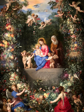
Divinity in the Details: Garland, Doctrine, and the Business of Beauty


This painting represents the collaborative horsepower of Antwerp’s 17th-century art scene, where specialization wasn’t just tolerated, it was strategic. Jan Brueghel the Elder, the reigning master of florals and landscapes, delivers a frame-within-a-frame, an elaborate, fruit-laden garland that surrounds the Virgin Mary, Christ Child, and Saint Anne. Hendrik van Balen, a figure painter with ties to elite patrons and a resume that includes mentoring Anthony van Dyck, steps in to handle the human form. The result isn’t a compromise; it’s a merger. Brueghel supplies the maximalist still life, pomegranates, cabbages, birds, and blooms with Flemish precision, while van Balen anchors it with religious gravity. It’s a power play wrapped in spiritual iconography, calibrated for private devotion or ecclesiastical display.

The timing is deliberate. Painted during the Counter-Reformation, this work is engineered to meet Rome’s directive that religious art should inspire piety and push back against Protestant austerity. You get the Virgin and Child, yes, but you also get a Marian ecosystem: heaven, earth, kinship, redemption, and creation are all stitched together through this visual theology. The putti, who hover like holy logistics staff, are not ornamental. They form a spiritual supply chain, lifting the garland heavenward in one moment and anchoring it to earth in the next. This isn’t just decor, it’s a metaphor for divine mediation. The garland isn’t just a botanical halo; it’s a bridge.

This is also a painting about status, of the holy family, of Catholic orthodoxy, and of the artists themselves. Brueghel’s meticulous plant taxonomy wasn’t just for show. It signals erudition, access to global trade (many of these plants were exotic imports), and an intellectual engagement with natural theology. Van Balen’s figures, by contrast, do the emotional heavy lifting, expressive, and tightly composed, but not overwrought. Together, the painting reads like a thesis statement for Catholic material culture: Beauty is a vessel for truth, and sensory overload is entirely acceptable if it gets you closer to God. Or at least back into the pews.

If the divine can be encircled by vegetables, cherubs, and symbolic horticulture, why do so many modern efforts at meaning-making feel thin and under-designed? Where exactly did the ambition go?

#FlemishNotFlimsy #BaroqueStrategy #VanBalenBrueghelLtd #CounterReformThis #PuttiOnTask #IconographyWithTeeth #OilPaintedFlex #HolyAndHeavy #GarlandEconomy #NotJustAFrame

Friday, June 27, 2025

🎬 “Rock-A-Bye Baby” (1958) – A Triplet-Sized Comedy Wrapped in Technicolor Sentimentality ★★★☆☆


Let’s get this out of the way up front: Rock-A-Bye Baby is not a perfect film. It’s not even a particularly consistent one. But if you squint past the baby formula, Technicolor schmaltz, and a plot twist involving shotgun weddings, fake marriages, and real matadors (played by Jack Benny in a photo no less), you’ll find a charming, slapstick-laced vehicle for Jerry Lewis that tries, sometimes too hard, to cradle laughs in a bassinette of postwar values. Call it a nursery rhyme written by the team at MAD Magazine.

Origins in a Miracle (That Maybe Should’ve Stayed One)

The film is a very loose remake of Preston Sturges’ razor-sharp wartime screwball comedy The Miracle of Morgan’s Creek, a film so subversive in 1944 that it had the gall to laugh at small-town morality during a world war. Frank Tashlin, former Warner Bros. animator and one of Lewis’ favorite collaborators, brings a cartoon sensibility to this retread, but Sturges’ sophisticated cynicism is swapped for… triplets. Instead of satire, we get soft shoe routines and maternal coursework. One might argue that Rock-A-Bye Baby trades Sturges’ political edge for an extended Pampers commercial.

To be fair, the 1950s were not exactly a time for pushing boundaries in Hollywood. And Jerry Lewis, recently split from Dean Martin, was carving his solo path with manic energy and vaudevillian loyalty to sight gags, baby bottles, and the occasional faux-Latin lover. Paramount was happy to give him the keys to the crib, and Rock-A-Bye Baby became a pet project. The result? Something halfway between a Norman Rockwell painting and a live-action Looney Tune.

Casting Call: One Comedian, Three Babies, and a Matador Named Jack Benny

Lewis is front and center as Clayton Poole, the unlucky-in-love TV repairman turned accidental father figure to triplets that aren’t his (the baby boom in metaphor, literalized). His performance hits all the familiar notes: pratfalls, elastic expressions, and that earnest blend of sincerity and chaos that somehow reads as both lovable and exhausting. The film leans heavily on Lewis’ charm—at times, far too heavily.

Connie Stevens, as Sandy Naples (Carla’s younger sister and Clayton’s overlooked love interest), provides a dose of sweetness and surprising emotional grounding. She’s also the recipient of the film’s more grounded romance arc and confessed off-screen to having a real-life crush on Lewis—an energy that peeks through in their scenes. Marilyn Maxwell, playing Carla the movie star with a secret, does her best with a script that asks her to oscillate between diva and damsel. Her late husband Carlos (who never appears) is literally a photograph of Jack Benny in a bullfighter’s outfit. I would like to say that’s the weirdest part of the film, but then there’s also Lewis doing political impersonations on a fake TV set while dressed as his future Nutty Professor alter ego.

Shot on Universal’s backlot—including Colonial Street and Courthouse Square, which would later double as Hill Valley in Back to the Future—the film is a time capsule of studio-era ingenuity. Mrs. Van Cleeve’s house would become Norman Bates’ front porch, and two doors down, Herman Munster was just waiting to move in. This film might be the only place where sitcom suburbia and psychological horror share a fence.

Mixed Reviews and Five O’Clock Bedtimes

At release, Rock-A-Bye Baby was a moderate success. Audiences loved Lewis, and the baby antics (triplet hijinks! fire hose gags!) appealed to mid-century American sensibilities. But critics were less enchanted. The film felt disjointed to some, and the Sturges pedigree—if remembered at all—only drew unfavorable comparisons. On Rotten Tomatoes, the film floats at a lukewarm 63%, which feels about right: too charming to dismiss, too lightweight to revere.

Off-screen, the film’s production was unusually humane for the time. Lewis, a father himself, insisted on family-friendly work hours—8 to 5 only—so that cast and crew could be home for dinner. One suspects the Hollywood union heads didn’t know what to do with that. And in a move of semi-ironic poeticism, Lewis’ own son, Gary Lewis, appears in the film as young Clayton in a fantasy sequence. Let’s call it nepotism with a wink.

More of a Lullaby Than a Masterpiece

While Rock-A-Bye Baby doesn’t break new ground, it offers a snapshot of Jerry Lewis during his solo ascent, full of restless creative energy, sincere sentimentality, and a deep belief that slapstick could carry the weight of family life, love, and fatherhood—even if that fatherhood is entirely accidental and numerically excessive.

The film is also the final curtain call for Ida Moore and Frank Jenks, lending it an unintended air of transition—old Hollywood fading out just as Lewis’ technicolor chaos reached its prime. And in an odd way, it feels fitting that a movie so rooted in domesticity would end with a literal statue of Clayton and five babies outside the courthouse. In Midvale, even madness earns a monument.

Final Thoughts

Rock-A-Bye Baby is a strange cocktail of screwball legacy, suburban melodrama, and Jerry Lewis at his most hyperactive. It’s not essential cinema, but it is a fascinating time capsule—equal parts nostalgic and bananas. Like an old rattle found in the attic, it may be dented and dusty, but it still makes noise.

⭐️⭐️⭐️ out of 5

#JerryLewis #RockAByeBaby #1950sComedy #HollywoodBacklot #TripletsAndTrouble #TechnicolorParenting #MidvaleMadness #PrePsychoPorch #ConnieCrush #JackBennyMatador #ThreeStarsAndABottle


Theodoor van Loon: A Devout Brush in a Decadent Age


Theodoor van Loon (1581/82–1667) was not your average paint-splattered Flemish master chasing court commissions and silk-robed sitters. Born in Catholic Brussels during the tailspin of the Protestant Reformation, van Loon twice journeyed to Italy, not to sun himself on the Adriatic but to immerse himself in the throbbing heartbeat of Catholic visual propaganda. He emerged as a painter whose canvases married Rubensian flair with the emotional wallop of Caravaggio. And yes, you can almost feel the chiaroscuro whisper, “Let there be theological drama.”

While his contemporaries were busy flexing their anatomical bravado and over-caffeinating on Mannerist contortions, van Loon took a quieter, more sincere route. His religious paintings didn’t just illustrate sacred narratives, they humanized them. Rather than setting the Virgin’s birth in a marble palace with gold-leafed angels rehearsing for the Baroque Grammys, he planted it in a real, lived-in space, full of strong women, soft light, and the warm-blooded fatigue of labor (both maternal and artistic). His figures are intimate, relatable, and, dare we say, a bit exhausted, because holiness, like a good painting, takes work.

The Reformation, the Counter-Reformation, and the Baby Boom of Saints

Painted around 1630, The Birth of the Virgin lands smack in the middle of Catholicism’s visual counterstrike. The Council of Trent (1545–1563) had issued a spiritual subpoena: the Church needed art that was clear, emotionally accessible, and doctrinally bulletproof. Van Loon, always the good Brussels boy, complied. His compositions eschewed Mannerist noodling in favor of grounded storytelling, with figures who don’t pose so much as participate. Even the putti wrangling the red canopy above, normally the Baroque equivalent of screen-saver cherubs, seem to be breaking a sweat.

In contrast to the aloof allegories and convoluted iconographies of the late Renaissance, this painting feels like an act of visual midwifery: it delivers faith into the hands of the people. The birth of Mary, rarely shown in this naturalistic setting, becomes a domestic scene of tangible humanity, woven with care, shadowed with gravitas, and steeped in the Catholic idea that salvation history begins in the home. This is theological realism with a Flemish accent and a Roman heart.

Art, Meaning, and the Divine Diaper Change

So what’s The Birth of the Virgin really about? On the surface, it’s a devotional tableau—an altarpiece built to coax prayers and maybe a few confessions. But look deeper and you’ll see something more subversively tender. Van Loon gives us the rare spectacle of holy femininity in its full ecosystem: matronly wisdom, sisterly support, tactile care, and generational continuity. The baby isn’t Jesus—it’s Mary. And she’s not born to trumpets and halos, but into the same weary, loving arms that would cradle any child. It’s as if van Loon is telling us, “Even salvation needed a warm washcloth and someone to boil the linens.”

And really, isn’t that the miracle? That divinity enters the world not through spectacle, but through intimacy? That sacredness begins in a quiet room, with women doing what they’ve always done, make space for life, wrap it in cloth, and get on with the next thing.

So here’s the real question: If the Virgin Mary gets this much backup on her birthday, what’s stopping us from building altarpieces for the everyday heroines who get absolutely no cherubs for doing the exact same work?

#TheodoorVanLoon #BaroqueWithFeeling #DivineDomesticity #SacredRealism #CherubDrama #RubensWithRestraint #CaravaggioCousin #FlemishFaith #AltarpieceAesthetics #BirthOfTheVirgin #CatholicCounterstrike #MothersOfTheFaith #PatronSaintOfPostpartumCare

Thursday, June 26, 2025

No Need for Anxiety—It’s Just Murderously Funny: A Look Back at Mel Brooks’s Hitchcockian Spoof


Mel Brooks’s High Anxiety (1977) earns a solid four stars in my ledger, one short of perfection only because even the finest soufflé tends to deflate a hair after forty-plus years. Still, the film remains a master class in affectionate lampoonery: a valentine scrawled in disappearing ink, equal parts schtick and scholarship, aimed directly at Alfred Hitchcock’s cool, terrified heart.

The project’s origin story reads like a Hollywood séance. Brooks, riding the commercial thermals of Blazing Saddles and Young Frankenstein, wanted to tackle a “proper” genre spoof without the Wild West giddiness or slapstick Transylvanian lightning. Enter the Master of Suspense himself. Hitchcock entertained Brooks’s pitch, offered technical pointers, and even nit-picked the shower-curtain ring count (ten rings in Psycho, not Brooks’s thirteen, leave it to Hitch to know his bathware). Budget constraints scuttled some delicious gag ideas, picture the killer chasing Dr. Thorndyke onto a boat that promptly docks. Still, the core conceit survived: take a psychiatrist with vertigo, plug him into a murder plot, and watch the neuroses fly like pigeons at Fort Point.

Behind the camera, Brooks demonstrated uncharacteristic discipline. He screened SpellboundVertigoPsycho, and The Birds frame by frame with cinematographer Paul Lohmann, dissecting Hitchcock’s elliptical cuts and chiaroscuro lighting so he could rebuild them as punchlines. Shooting at Mount St. Mary’s for the ominous institute and the just-opened Hyatt Regency San Francisco for the atrium set pieces gave the parody real architectural heft, less “cheap gag,” more “luxury satire suite with cliff-side view.”

Casting decisions bordered on inspired nepotism, and thank goodness for it. Madeline Kahn’s Victoria Brisbane matches Brooks beat for beat, brandishing her trademark half-airy, half-exasperated line readings. Cloris Leachman’s Nurse Diesel—part sadist, part sad décor critic—might secretly run the ward’s purchasing office. Harvey Korman slithers through corridors as Dr. Montague, all condescension and collar starch. Gene Wilder was the first-string Thorndyke, but scheduling conflicts punted him; Brooks stepped in and discovered, lo and behold, he could headline his own movie. His rubber-band facial expressions and Sinatra-by-way-of-Catskills crooning give the film an ego that never balloons enough to pop.

Production anecdotes deserve their own DSM-V entry. Brooks hired The Birds’ original bird wrangler, then reported on The Tonight Show that half the avian “droppings” falling on his head were genuine—method pigeons, evidently. Barry Levinson’s bellhop channels the Psycho music sting with nothing more than lung power and rolled newspaper, demonstrating that low-tech can still shred nerves (and inkscape bathroom tiles).

Critics responded with polite applause, laced with a hint of finger-wagging. Roger Ebert admired the enterprise but noted that spoofing something already laced with Hitchcockian humor courts redundancy. Pauline Kael muttered that imitation is the sincerest form of—well, imitation. Yet audiences laughed, the box office rang up a healthy $31 million, and Hitchcock sealed his blessing with six magnums of Château Haut-Brion and the single-word benediction “Splendid.” Decades later, the film’s jokes about psychoanalytic jargon—“penis envy” recast as “pee-pee envy”—still manage to puncture earnest academic balloons without entirely letting the helium out of Hitchcock’s aura.

In hindsight, High Anxiety stands as Brooks’s last unqualified genre bullseye before the law of diminishing returns nipped at his heels. It is scholarly without pedantry, silly without sloppiness, and affectionate without fawning. If you can tolerate one more bird-related gastrointestinal gag and a few Freudian double-entendres that date like avocado kitchen tiles, you’ll find a comedy that balances reverence with irreverence better than Thorndyke balances atop that San Juan Bautista bell tower. Vertigo never felt so jaunty.

⭐⭐⭐⭐ (4/5 Stars)

#HighAnxiety #MelBrooks #HitchcockHomage #ComedyReview #FilmNerds


Pastoral Power Plays: Jan Brueghel the Elder’s Landscape with the Château de Mariemont


Landscape with the Château de Mariemont is no idle postcard of real estate envy. Painted circa 1609–1611 by Jan Brueghel the Elder, this jewel-box panel (now in the Virginia Museum of Fine Arts) lays out a dizzying, bird’s-eye banquet of courtly power, ecological inventory, and subtle propaganda: hunters trumpet in the left corner, a bird of prey hovers like an airborne exclamation mark, and the château itself, blue-tiled roof sparkling, towers over an estate so perfectly managed it could double as a Google Earth demo for “serene hegemony.” The foreground bristles with Brueghel’s trademark miniaturist bravura (note the satin sleeve glints and the dogs' individually snouted faces), while the horizon recedes in silvery tiers, proving that the painter handled aerial perspective as confidently as a modern drone pilot. 

Squeeze the surface and out drips quiet power messaging. Every meticulously fenced pasture and geometrically aligned pathway whispers, “Relax, peasants, Habsburg order has you covered.”  The painting choreographs nature and architecture into a visual symphony of stability, suggesting that under Archduke Albert and Archduchess Isabella, even the clouds obey protocol. Yet Brueghel isn’t all sobriety; he sprinkles tiny anecdotal pleasures, rolicking dogs, gossip-scaled riders, and birds practicing formation flying, so that viewers can oscillate between macro-grandeur and micro-delight like caffeinated tourists toggling the zoom wheel on their phones.

Jan Brueghel, nicknamed “Velvet” for the plush softness of his paint surface, was the second son of Pieter Bruegel the Elder, meaning he inherited both a dynasty and the pressure of living up to a surname that already carried more weight than a cathedral ceiling. After an Italian grand tour where he absorbed everything from Roman ruins to Lombard sunsets, Jan parked himself in Antwerp and became court painter to Albert and Isabella, churning out landscapes, floral bouquets, and allegoric smorgasbords with an encyclopedic zeal that would put modern data analysts to shame. 

What distinguished Brueghel wasn’t just virtuoso brushwork but a taxonomist’s obsession with cataloguing creation. Whether rendering 150 distinct plant species in a single garland or classifying Noah’s Ark worth of fauna in his “paradise” scenes, he painted as if competing in a Flemish version of Jeopardy! category: “Everything That Exists.” Collaboration didn’t faze him either; he routinely outsourced the big, swaggering figures to his friend Rubens while he handled the delicate stuff. Think of them as the early Baroque equivalent of a buddy-cop movie: Rubens packs the brawn, Bruegel brings the forensic detail.

Finally, Brueghel’s studio functioned like a 17th-century start-up, sons, cousins, and assistants pumping out variations to meet pan-European demand. Yet even amid industrial-scale production, Jan’s personal hand remains unmistakable: enamel-like luminosity, precision so fine you suspect magnifying lenses, and color harmonies richer than a Habsburg dowry.

When this canvas was hatched, the Spanish Netherlands were wobbling through the Twelve Years’ Truce—a rare breather in the Eighty Years’ War. Albert and Isabella seized the lull to market their rule as a golden age of peace, faith, and careful land management. The Château de Mariemont, resurrected from earlier fires and rebellions, became their hunting Valhalla and PR backdrop. Commissioning Brueghel to eternalize the estate was less vanity project and more strategic brand refresh: “Look, Europe—our dominion isn’t a battlefield; it’s a Renaissance theme park with good plumbing.” 

The château itself had Habsburg DNA dating back to Queen Mary of Hungary, but Albert’s renovations turned it into a Baroque hospitality suite—think pheasant banquets, diplomatic strolls, and the occasional falconry flex. By planting this sparkling lodge at the center of an orderly Eden, Brueghel served up a visual memo that sovereignty equals stewardship. Meanwhile, Protestant rebels to the north surely groaned: propaganda never looked so pastoral.

Economically, the painting dovetailed with Antwerp’s art boom: high-octane Catholic patronage met a maturing art market craving luxury goods. Brueghel’s panel would slot neatly into a collector’s cabinet, functioning as both conversation piece and subtle reminder that the good life flows from stable governance and—naturally—excellent taste in painters.

Strip away the gilt frame and what you really have is a 17th-century flex on Instagram: “#Blessed to be hunting on my 30,000-acre weekend retreat—swipe left for slow-mo falcon footage.” Brueghel’s vistas are the original humblebrags; he just swapped influencers for archdukes and replaced ring lights with heavenly illumination. Beyond the brag, though, lies a proto-environmental manifesto: harmony arrives when humans choreograph, not bulldoze, the natural world. His trees aren’t chopped firewood; they’re living columns in a cathedral of chlorophyll—sermon topic: “Don’t screw up paradise, folks.”

So, if Brueghel were alive today, would he be painstakingly mapping biodiversity for the EU Green Deal, or live-tweeting falcon hunts from a rooftop bar?

#VelvetBrueghel #MariemontMagic #PowerLandscapes #CourtlyFlex #ArtHistoryHumor


Wednesday, June 25, 2025

A 3-Star Review of The Family Jewels (1965): Seven Jerries, One Diamond Ring, and a Flying Tin Can


Let’s start with a basic truth: The Family Jewels is not peak Jerry Lewis, it’s Jerry Lewis on a sugar high, locked in a room with a costume rack and an existential need to prove that he can play every character in the movie. And he does. Seven times. If you’ve ever asked yourself, “What if The Nutty Professor went on a weird, PG-rated vision quest through the American male archetype?”—well, welcome aboard. It’s a film that’s both admirably ambitious and maddeningly uneven, a cinematic sandbox for Lewis’s comedic impulses, and a gentle exercise in child-led emotional logic. Also, there’s a gangster. And a clown. And a Ford Tri-Motor aircraft that, miraculously, did not unionize and fly off in protest.

A Swiss Army Lewis

Filmed over the course of just under three months in 1965 and released by Paramount that July, The Family Jewels is a showcase for Jerry Lewis in full auteur mode: co-writer, director, producer, and every uncle your therapist warned you about. This film came hot on the heels of his earlier directorial successes, especially The Nutty Professor, and it’s hard not to see this as a spiritual sequel, only this time, the Jekyll-and-Hyde concept has exploded into a hydra of caricatures.

Jerry Lewis was clearly riding high on creative control and perhaps a bit too much caffeine. The plot, such as it is, functions more like an episodic excuse to trot out one exaggerated character after another. This isn’t so much a movie as it is a collection of sketches loosely connected by the need to find a suitable guardian for a precocious heiress. The screenplay serves more as a trampoline for Lewis’s brand of physical and vocal comedy than a coherent narrative, but if you’re here for cohesion, you’re in the wrong circus tent.

One Man, Many Hats (Literally)

The heart of the film, oddly enough, is not Jerry Lewis times seven, but Donna Butterworth, a child actor who somehow manages to ground the film with grace, sincerity, and a devastatingly good deadpan. As Donna Peyton, a ten-year-old heiress tasked with picking a new father from six outlandish uncles, she holds her own admirably. (She’d go on to make exactly one more film, with Elvis, no less. It was the Sixties. Career paths were different.)

Each uncle Lewis plays is more absurd than the last: an over-caffeinated photographer, a shell-shocked ex-circus clown, a pilot whose airline experience is… questionable at best. Perhaps the most eyebrow-raising of all is Bugsy Peyton, a mobster who seems to have stepped out of Guys and Dolls by way of Looney Tunes. Lewis’s chauffeur character, Willard Woodward, is the narrative glue, a humble, bumbling guardian angel with a heart of gold and shoes reliably on the wrong feet.

Production trivia buffs get their gold star here: the aircraft used in the film, a 1929 Ford Tri-Motor, is a legit aviation antique and, as of 2022, still exists in airworthy condition. It’s a beautiful relic, even if, in the film, it primarily serves to propel Lewis into a plot detour. Toss in cameos by Gary Lewis & The Playboys (yes, that Gary), and you’ve got a movie very determined to prove that nepotism is adorable.

From Boisterous to Cartoonish

Critically, the film landed like a whoopee cushion, amusing to some, irritating to others, and vaguely nostalgic to those who remember it fondly. Rotten Tomatoes gives it an 80%, which is possibly the result of five very forgiving reviewers. Modern audiences may struggle with the film's pace and episodic structure, but it holds undeniable appeal for Jerry Lewis die-hards and lovers of 1960s cinematic curiosities.

Perhaps more enduring than the film itself is the animated tribute it spawned: Will the Real Jerry Lewis Please Sit Down, a Saturday morning cartoon that distilled Lewis’s multiple personalities into a Saturday-sized dose of chaos. Even decades later, the movie retains a kind of charm, like a boisterous uncle who talks too much at Thanksgiving but somehow still makes you smile.

In sum, The Family Jewels is a flawed but earnest effort. It’s part vaudeville, part sitcom, and part heartfelt ode to the kind of dad who shows up disguised as your mobster clown uncle just to make you laugh. Three stars for the effort, the ambition, and the chutzpah. And for the Ford Tri-Motor. That thing’s a star.

⭐️⭐️⭐️ out of 5

#JerryLewis #TheFamilyJewels #1965Cinema #VintageComedy #FordTrimotor #DonnaButterworthDeservedBetter #ThisDiamondRing #SevenTimesTheLewis


Baroque Block Party: Revelry, Rhythm, and Reflection in David Teniers the Younger’s Village Dance with a Crowd


David Teniers the Younger drops us straight into the rollicking heart of a Flemish kermis. The scene is a kinetic ribbon of villagers streaming left to right, arms linked, cheeks flushed, and spirits unmistakably high. Teniers arranges the figures almost like musical notation, clusters of red caps, fluttering kerchiefs, and swinging tankards punctuate the score, so your eye dances in rhythm whether you want to or not. Domestic animals add comic punctuation: a terrier mid-pounce, chickens scattering, and a wheelbarrow toppled as if it too succumbed to the beat. Light slices through broken clouds to illuminate the crowd exactly where the party is hottest, a subtle stage-lighting trick that keeps divine judgment hovering politely in the wings while the mortals make merry.

Step back, and the architecture cues another layer. The thatched cottages lean in like curious neighbors, framing the dancers and reinforcing the intimacy of village life. Beyond, a church spire sits just inside the horizon, a pictorial whisper that revelry and piety share the same postcode. Teniers’ palette—earth browns, sage greens, muted blues—grounds the fantasy in believable soil, but well-placed flashes of vermilion and snowy linen keep the whole affair visually caffeinated. He’s saying, “Yes, it’s rural, but dull it is not.”

Look closer still and you’ll catch a miniature anthropology lesson: age, gender, and station mingle freely, contradicting any notion that 17th-century peasants lacked sophisticated social choreography. Far from a drunken free-for-all, this is a ritual of cohesion. You can almost hear the fiddles elbowing for prominence—and you can almost smell the ale. In the lower right corner, a rooster crows on cue, perhaps reminding us that dawn (and the inevitable hangover) is just one stanza away. Nothing gold can stay—so pass the jug again.

The Man Behind the Merriment

David Teniers the Younger (1610–1690) was the Flemish Baroque’s resident master of “serious fun.” Trained by his painter-father and sharpened by the gritty realism of Adriaen Brouwer, he forged a signature blend of meticulous draftsmanship and democratic subject matter. Court patrons adored him precisely because he dignified peasants without prettifying them—a diplomatic coup in pigment. By 1650, he was so trusted that Archduke Leopold Wilhelm tapped him to curate one of Europe’s flashiest art collections. Imagine being both a star player and a museum director. Teniers pulled it off while still sneaking time to paint villagers who looked like they could finish your beer.

Technically, his brushwork is deceptively loose; up close, the foliage dissolves into abstract dabs, yet from a few steps back, every leaf rearranges itself with military discipline. Faces get just enough modeling to telegraph personality, but never so much that anonymity—or universality—is lost. In Village Dance, you see his trademark lighting: a theatrical shaft that spotlights the human comedy yet refuses to moralize. He understood spectacle, but he also understood restraint, ensuring that no anecdote upstages the ensemble.

His entrepreneurial streak was just as impressive. Teniers churned out genre scenes for a pan-European clientele hungry for exotic “peasant exotica” while simultaneously marketing engravings of the Archduke’s collection, a 17th-century content-distribution hustle worthy of modern social-media gurus. If Instagram had existed, Teniers would have run the algorithm.

A World in Flux—Historical Backdrop

Seventeenth-century Flanders, technically known as the Spanish Netherlands, was a hub of political tension, religious fervor, and commercial ambition. The Eighty Years’ War ground to a mother-of-all-stalemates in 1648, leaving towns eager for normalcy—and parties. The Catholic Counter-Reformation still loomed large, encouraging art that affirmed community and faith without toppling into sin. Enter the kermis: a sanctioned carnival mixing sacred and secular, mass and mess, devotion and debauchery in equal measure.

Economically, urban elites made fortunes trading textiles and grain while rural laborers slogged through uncertain harvests. Genre painting allowed buyers to indulge their voyeuristic curiosity about rural life from the safety of silk-draped drawing rooms. Yet Teniers wasn’t merely pandering; he charted a middle course between Pieter Bruegel’s moralizing and Rubens’ aristocratic grandiosity. His peasants dance not because they’re symbols of sin or salt-of-the-earth caricatures—they dance because that’s what people do when the harvest is in, the ale is flowing, and tomorrow’s taxes can wait until tomorrow.

Art-historically, the piece stands at a crossroads between late Renaissance humanism and proto-Enlightenment curiosity. The idea that ordinary people might embody universal truths, such as joy, fellowship, and mortality, was gaining traction. Teniers provided visual evidence. He gave the rising bourgeoisie an image of “authentic” community life, even as their own urban existence drifted further from it. Call it the original rural nostalgia filter.

Strip away the lace cuffs of art history, and Village Dance with a Crowd is a 400-year-old TED Talk on collective effervescence: humanity’s uncanny knack for syncing heartbeats to a common rhythm. Teniers tells us, with zero sugar-coating, that life’s most significant truths occasionally surface between spilled ale and squawking hens. The villagers aren’t escaping reality; they’re rehearsing resilience. In an era of plague flare-ups and tax hikes, that’s as subversive as it is celebratory.

Look again at the lean toward the church spire and the dog sprinting across the foreground, memento mori meets puppy optimism. Translation: yes, the party ends, but while the fiddles still saw and the clouds still part, you’d better whirl like rent is due at sunrise (spoiler: it was). Teniers saw the peasant dance not as a punchline but as a populist manifesto, joy as a valid response to chaos.

If you were magicked into this merry procession, would you grab a tambourine, herd the chickens, or sprint for the nearest exit? Choose wisely, history is watching.

#FlemishFiesta #TeniersTuesday #BaroqueAndRoll #KermisCrew #ArtHistoryHumor

Tuesday, June 24, 2025

★★★☆ (4/5) – A Boy, a Wizard, and Enough Animal Metamorphoses to Warrant a PETA Investigation


T. H. White’s The Sword in the Stone is the only bildungsroman I know that teaches political science via pike-dictatorship, workplace culture via fascist ants, and pacifism via high-altitude goose lectures—all before the hero can shave. Four stars, because its whimsy still crackles and its moral backbone still rings true, even if the pacing occasionally flutters like Merlin’s moth-eaten robes.

How the Manuscript Escaped the Stone

First published by Collins in London in 1938, the novel began as a standalone romp—White essentially asking, “What did Arthur do before he got the cool sword?”- and answered with equal parts schoolboy prank and Platonic seminar. A trans-Atlantic rewrite followed for Putnam’s 1939 U.S. edition, smoothing slang and tightening scenes for American sensibilities.  

The book’s real molt came in 1958, when White revised it for inclusion as Book I of his tetralogy The Once and Future King. He inserted darker, overtly political episodes (ants, geese) cannibalized from an abandoned fifth volume, and quietly excised some pure-fun set pieces (farewell, Madam Mim). Scholars still bicker: purists mourn the lost whimsy, moral philosophers cheer the added bite.

White’s timing, alas, was prophetic. Writing between the world wars, he distilled his horror at fascism into anachronistic jokes and zoological allegories. Merlin may live backward, but the author wrote forward, against violence, against nationalism, and against any tyrant who thinks ruling is just glorified sword-yanking.

Quirky Tutor, Reluctant King

White himself was a Cambridge-educated falconry nerd who fled London to live alone with hawks and typewriters. That oddball independence leaks straight into Merlin: the tutor who quotes modern plumbing patents in medieval kitchens and believes the best civics lesson is turning your pupil into a fish under an autocratic pike.

Plot-wise, the orphaned “Wart” endures knight-school hazing with foster brother Kay, meets Merlin, and shape-shifts through forests, moats, and anthills until his CV reads “squire, beetle-traumatized ant, accidental king.” The famous anvil moment lands only after a cavalcade of empathy lessons; its brilliance is how the sword feels earned not by strength but by moral seasoning.

White leavens this with Monty-Python-adjacent humor: jousting vocab lampooned, Saxon invaders described as “teutonic nuisances,” and a talking owl whose eloquence would make Oxford tutors blush. The book’s greatest trick is convincing you that all this silliness is deadly serious about power and responsibility.

From Modest Sales to Mythic Status 

Contemporary critics praised White’s wit yet muttered about tonal whiplash—half fairy tale, half political satire. Sales were solid, but it was the 1963 Disney adaptation (and countless school syllabi) that rocketed Wart into pop culture knighthood.

The novel has since gilded its résumé with accolades: Time magazine slotted it onto its list of the 100 Best YA Books of All Time in 2015, while Worldcon voters handed it the 1939 Retro-Hugo Award for Best Novel in 2014, proof that geeks will invent time travel if necessary to decorate deserving classics.  

Legacy-wise, White bequeathed fantasy three durable tropes: the backward-aging mentor, the chosen one who’d rather nap, and the idea that education should be experiential (preferably with feathers). Echoes ripple through Rowling’s Dumbledore, Pratchett’s patrician humor, and every YA hero who learns empathy before combat. Not bad for a story that starts with a lost hawk and ends with world governance.

Final Verdict

If you’ve ever wished your civics class included more transfiguration and fewer spreadsheets, The Sword in the Stone is your grail. It’s a charming, occasionally chaotic tutorial on why kindness should precede kingship—and why laughing at power is sometimes the sharpest blade of all.

⭐⭐⭐⭐ (4/5 Stars)

#ArthurianGlowUp #MerlinMentorship #YAClassic #AnimalAllegories #FourStarStone

The Parrot, the Lobster, and the Meaning of Life: Jan Davidsz. de Heem’s Decadent Reminder


Take one African grey parrot (imported, naturally), add an aristocratic lobster lounging like it owns the table, heap on grapes so plump they could burst into wine, scatter fractured walnut shells, and then, just to taunt the Calvinists, dangle a gold watch on a flirtatious blue ribbon. De Heem composes this sensory traffic jam with surgical precision: a vapor bloom on grapes, pomegranate seeds glistening like rubies, glassware catching fugitive highlights. Light pools in velvet darkness, making every fruit, shell, and feather pop as if auditioning for a 17th-century food-porn calendar. It is equal parts banquet and rebuke: “Here’s everything money can buy, just remember the clock is ticking, darling.”

Jan Davidsz. de Heem (1606–1684) was a Netherlandish chameleon. Born in Utrecht, he absorbed Dutch precision; in Antwerp, he inhaled Flemish flamboyance. His studio resembled a botanical lab crossed with a curiosity shop. Apprentices stacked objects while Jan tweaked compositions so crowded they bordered on the reckless, yet never tipped into chaos. He became the rock star of the pronkstilleven (“ostentatious still life”) genre, and collectors threw florins at him like confetti. Competitors copied his bloom effects; pupils plagiarized whole bouquets; de Heem replied by adding an extra lobster or a stray violin just to prove he could.

Late in life, he bounced between the Protestant north and Catholic south, selling moral sermons dressed as gourmet platters. He also ran a family franchise—sons, cousins, and possibly the cat cranked out de Heem-branded still lifes long after Jan had set down his mahlstick.

By the 1640s, the Dutch Republic was printing money faster than you can say “East India Company.” Amsterdam’s warehouses bulged with Brazilian sugar, Persian silks, and, yes, African parrots. A middle-class flush with cash wanted art that flaunted this bounty. Meanwhile, Calvinist sermons thundered about vanity; Antwerp’s Catholic merchants shrugged and said, “Pass the oysters.” De Heem straddled both worlds. He delivered the bling, but he smuggled in subtle reminders that moth and rust (or at least citrus rot) destroy all.

Antwerp, where this canvas was likely painted, acted as Europe’s retail showroom. Paintings were commodities, and still lifes offered international bragging rights without the political baggage of history scenes or portraits. The genre’s code was clear: depict perishables so vividly that the buyer can almost smell them—and hint, sotto voce, that life is just as perishable.

Is this canvas a champagne toast to globalization or a Calvinist side-eye at excess? Yes. The lobster’s crimson vanity, the pomegranate’s messy promise of renewal, and the parrot’s literal parroting all bask under the ticking watch. De Heem stages a visual mic-drop: “Indulge, but remember you’re on a deadline.” Our modern takeaway? Even your latest iPhone will one day sit in the tech graveyard beside that golden pocket watch, so savor the moment, but maybe compost the lemon peel.

If de Heem painted your life’s “pronkstilleven” today, what objects would he pile high to celebrate, and quietly indict, your version of abundance?

#VanitasWithBenefits #DutchGoldenAgeGoals #PronkAndCircumstance #EatPrayStillLife #ArtHistoryMicDrop


Monday, June 23, 2025

King Creole: Elvis Presley’s Grittiest, Grooviest, Most Grown-Up Gig

Elvis Presley’s King Creole is what happens when Michael Curtiz borrows a pulp novel, splices in Bourbon-Street noir, and hands the mic to a 23-year-old superstar who’s about to trade blue suede shoes for Army fatigues. The result is a moody, black-and-white jambalaya, equal parts teenage melodrama, gangster flick, and impromptu concert, that somehow works far better than logic suggests. It’s the rare Presley vehicle that revs its engine on something sturdier than wiggling hips.

Back in 1955 producer Hal B. Wallis plunked down $25,000 for Harold Robbins’s gritty boxing novel A Stone for Danny Fisher, imagining James Dean dodging uppercuts in a New York tenement. Then Dean drove off a cliff, Ben Gazzara got busy, and Hollywood decided, “Fine, let’s swap gloves for a guitar.” By 1957 Elvis’s chart dominance made him the obvious substitute, and the script migrated south to New Orleans faster than a snowbird in February.

Enter Michael Curtiz, he of Casablanca fame, who insisted on inky cinematography to give Royal Street an existential hangover. Convinced the King was merely a swivel-hipped punk, Curtiz demanded Presley lose fifteen pounds and his proud sideburns; Elvis did both, thus inventing the crash diet by fan hysteria. The kicker? Curtiz soon called him “a lovely boy” and predicted real acting chops.

Draft boards rarely respect art, but even Uncle Sam blinked when Paramount threatened to torch $350,000 in sunk costs. Presley nabbed a 60-day deferment, shot the picture, then dutifully reported for boot camp, proving that only the U.S. Army could upstage Colonel Tom Parker on a contract clause.

Curtiz padded his swamp-lit drama with Walter Matthau as mobster Maxie Fields, Carolyn Jones as the smoky-voiced siren Ronnie, and Dolores Hart as good-girl Nellie (five years before she swapped red carpets for a convent in Connecticut). Matthau’s abiding memory: smashing a balsa-wood chair over Elvis’s back, post-lunch, and watching the star lose his gumbo on cue, a method performance in gastrointestinal realism.

On location, Presley had to sprint across adjoining rooftops to dodge crowds. When that failed, Wallis relocated him to the tenth floor of the Beverly Wilshire, protecting an asset the way Fort Knox guards bullion, though fans still slipped pralines (and the occasional nine-year-old extra named Richard Simmons) through the barricades.

The plot? Danny Fisher (Presley) is a dropout trapped between paternal guilt, two women, and a crime boss. He sings “Trouble” so raw it could peel paint, punches Vic Morrow’s “Shark,” and survives enough moral whiplash to earn a final curtain call at the King Creole club. It’s noir-lite—yet every time the narrative stalls, Elvis drops a torch song that re-ignites the screen.

Critics were stunned: Variety declared Presley “better than fair,” Billboard hailed “his best acting performance to date,” and rumor had him flirting with an Oscar nod (never happened—but blame studio prejudice, not the performance). The film debuted at No. 5 on Variety’s box-office chart, and the single “Hard Headed Woman” bulldozed its way to No. 1 on Billboard.

Walter Matthau later praised Elvis as “instinctive… intelligent… elegant,” none of which prevented 50 irate Florida debutantes from assaulting his car for daring to clobber their idol on screen. Meanwhile, critics outside the U.S. gave the picture a mixed side-eye; one British columnist lamented Presley’s “weary cherubic decadence,” apparently unmoved by jazzy scenery or Carolyn Jones’s flu-ridden kiss-dodging.

Today King Creole enjoys a 96 percent Fresh rating, a 4K restoration (premiered 2019) that makes New Orleans humidity practically bead on your TV, and cult status as “the Elvis movie you recommend to people who hate Elvis movies.” It’s also the only Presley flick that unites Sammy Davis Jr. cameos, Marlon Brando set visits, and a future nun in the supporting cast. Not bad for a production born of tragedy and salvaged by swagger.

Is King Creole perfect? No; the melodrama is thicker than a roux and some subplots wobble like cheap Mardi Gras beads. But Presley’s brooding charisma, Curtiz’s noir lens, and a surprisingly sharp supporting ensemble elevate this from jukebox cash-grab to genuinely compelling cinema. Four stars—because even the King deserves room to grow, and here he almost becomes royalty.

⭐⭐⭐⭐ (4/5 Stars)

#KingCreole #ElvisOnFire #NoirWithGuitars #BourbonStreetBlues #4StarSwing


Still Waters, Subtle Brilliance: Salomon van Ruysdael and the Art of Doing Absolutely Everything Quietly


Salomon van Ruysdael plants you on the quiet bend of a Dutch river and politely refuses to let you leave until you’ve exhaled. At 43 × 62 inches, the canvas is large enough to feel like a window, minus the draft, and its tonally restrained palette of pearl-gray sky, honeyed clouds, and olive-green foliage keeps the drama at a whisper. Sails glide like lazy punctuation marks; a lanky willow leans in, gossiping with its own reflection; and that distant church steeple reminds you someone, somewhere, is ringing the supper bell. Ruysdael’s brushwork is all about suggestion: he coaxes atmosphere from thin veils of pigment, letting light seep through as if the linen itself were glowing. The scene is so serenely calibrated that even the ripples seem to have signed a non-aggression pact.

Look closer and you’ll notice his sly compositional geometry: diagonal cloud bands counterweighted by the tree’s rising arc, a horizontal river that doubles as a timeline, and foreground canoes that stage-whisper, “Yes, we’re tiny, but we’re the human interest you ordered.” Everything funnels our eyes toward infinity, yet nothing hurries the journey. It’s the visual equivalent of a good Dutch canal lock: orderly, efficient, and utterly calm, unless you’re the one who forgot to tie up the boat.

Born around 1602 in Naarden and later based in Haarlem, Salomon van Ruysdael was a painter who turned “commuting by ferry” into high art. Unlike his flashier nephew Jacob, whose storm-tossed forests make you want to buckle a life vest, Salomon specialized in the contemplative middle register: placid rivers, big skies, and just enough farmers to keep the tax base happy. He joined the Haarlem Guild of St Luke in 1623 and stayed loyal to the city’s tonal landscape tradition, preferring subtle daylight to Baroque theatrics. He was, in short, the introvert of Dutch landscape, whispering sweet nothings in muted earth tones.

Ruysdael’s business acumen rivaled his brushwork. He bought and sold blue dyes (woad and indigo) to keep the studio lights on, which may explain his disciplined palette; nothing like haggling over pigments to teach economy of color. While contemporary critics fawned over Ruisdael-with-an-i (Jacob), Salomon’s reputation rested on something rarer: consistency. If you ordered a Ruysdael, you got tranquility with a side of civic pride, no surprises, no misfired symbolism, and certainly no saints floating overhead to ruin the weather.

The Dutch Golden Age was essentially a century-long victory lap: swollen trade coffers, a navy that could double-park in three oceans, and an art market so robust that tulip bulbs had to fight for wall space. Landscape painting boomed because it allowed citizens to celebrate the real hero of the Republic, land wrested from the sea with windmill-powered stubbornness. Ruysdael’s river vistas were civic selfies avant la lettre: “Look, Ma, no Spanish Inquisition, just calm water and sensible boats!”

Haarlem, his home base, was the Silicon Valley of sky studies. Painters there perfected atmospheric perspective, using layered grays and soft focus to create the illusion of infinity in rental-friendly proportions. Patrons snapped up these canvases for domestic interiors, where a vicarious stroll by the river could offset the claustrophobia of narrow canal houses. By 1645, when A River Landscape sailed off Salomon’s easel, buyers craved peace after decades of the Eighty Years’ War. A painting that looked like Sunday afternoon every day of the week? Sold.

A River Landscape is a hymn to measured optimism: humankind appears, but only as small, hat-wearing footnotes amid the grand prose of clouds and water. Ruysdael’s message is clear: run your commerce, trim your sails, but remember who’s boss (hint: it isn’t you). In a world now grappling with climate creep and waterfront real-estate panic, the painting reads like vintage sustainability advice: respect the river or start budgeting for sandbags. It’s pastoral therapy with a Calvinist disclaimer: beauty is fleeting, keep your accounts in order.

If Salomon could teleport to our era, would he paint a serene data lake, or file a noise complaint about jet skis first?

#A RiverLandscape #SalomonVanRuysdael #DutchGoldenAge #ArtHistoryNerd #CloudsForDays #PainterOfCalm #MuseumHumor #17thCenturyVibes

🎬 One Star to Rule Them All: The Beatniks (1959) and the Case of the Missing Beatniks

There are cinematic misfires, and then there is  The Beatniks,  a film so wildly off-target it could only have been named during a caffeine ...